Colour Energy stands as the destination for colour and aura products, services, education, as well as wellness & energy-enhancing colour therapy solutions.
Context
Work on behalf of Colour Energy as Senior Graphic Designer, 2016-2018
Work on behalf of Colour Energy as Senior Graphic Designer, 2016-2018
Contributions
Shopify & Wordpress Websites
Managed & Created Assets for Social Media Channels
White Labelling Materials
Yearly 100+ Page Catalog
Monthly Omni-channel Campaigns
Maintained Price-lists for Canadian & US Markets
Packaging & Logos
Shopify & Wordpress Websites
Managed & Created Assets for Social Media Channels
White Labelling Materials
Yearly 100+ Page Catalog
Monthly Omni-channel Campaigns
Maintained Price-lists for Canadian & US Markets
Packaging & Logos
Collaborators
Owner & Sales Manager
Owner & Sales Manager
The Project
Colour Energy Corporate Marketing
Impactful, engaging omni-channel marketing assets
Colour Energy Corporate Marketing
Impactful, engaging omni-channel marketing assets
My Design Responsibilities
Based in Vancouver, I collaborated on-site with Colour Energy, managing multiple brands under its umbrella, including Gaia Garden, Ashbury's Aromatherapy & The Chakra Company. Leveraging my expertise in content management platforms, including Shopify and WordPress, I successfully developed and maintained websites for four sister companies. My focus was on creating user-friendly layouts, intuitive navigation, and impactful call-to-actions to enhance the online presence of these businesses.
Based in Vancouver, I collaborated on-site with Colour Energy, managing multiple brands under its umbrella, including Gaia Garden, Ashbury's Aromatherapy & The Chakra Company. Leveraging my expertise in content management platforms, including Shopify and WordPress, I successfully developed and maintained websites for four sister companies. My focus was on creating user-friendly layouts, intuitive navigation, and impactful call-to-actions to enhance the online presence of these businesses.
In addition to website management, I spearheaded comprehensive B2B and B2C marketing strategies across six distinct brands. This multifaceted role encompassed designing and executing email campaigns, producing price lists, catalogs, packaging, labels, and various promotional materials, such as handbills and drop-boxes. I also took charge of crafting dynamic social media content to engage and captivate our audience.
Furthermore, I made a significant impact by expanding the digital footprint of five companies through the curation of tailored ads and visually captivating graphics. This strategic approach resulted in remarkable growth metrics, including a remarkable 250% surge in Facebook engagement, a 105% increase in post reach, a 150% uptick in page likes, and an impressive 400% rise in video views. My dedication to driving results and enhancing brand visibility is a testament to my ability to excel in high-impact roles.
UX/UI Design
Website Design
Elevating Brands, One Website at a Time
Website Design
Elevating Brands, One Website at a Time
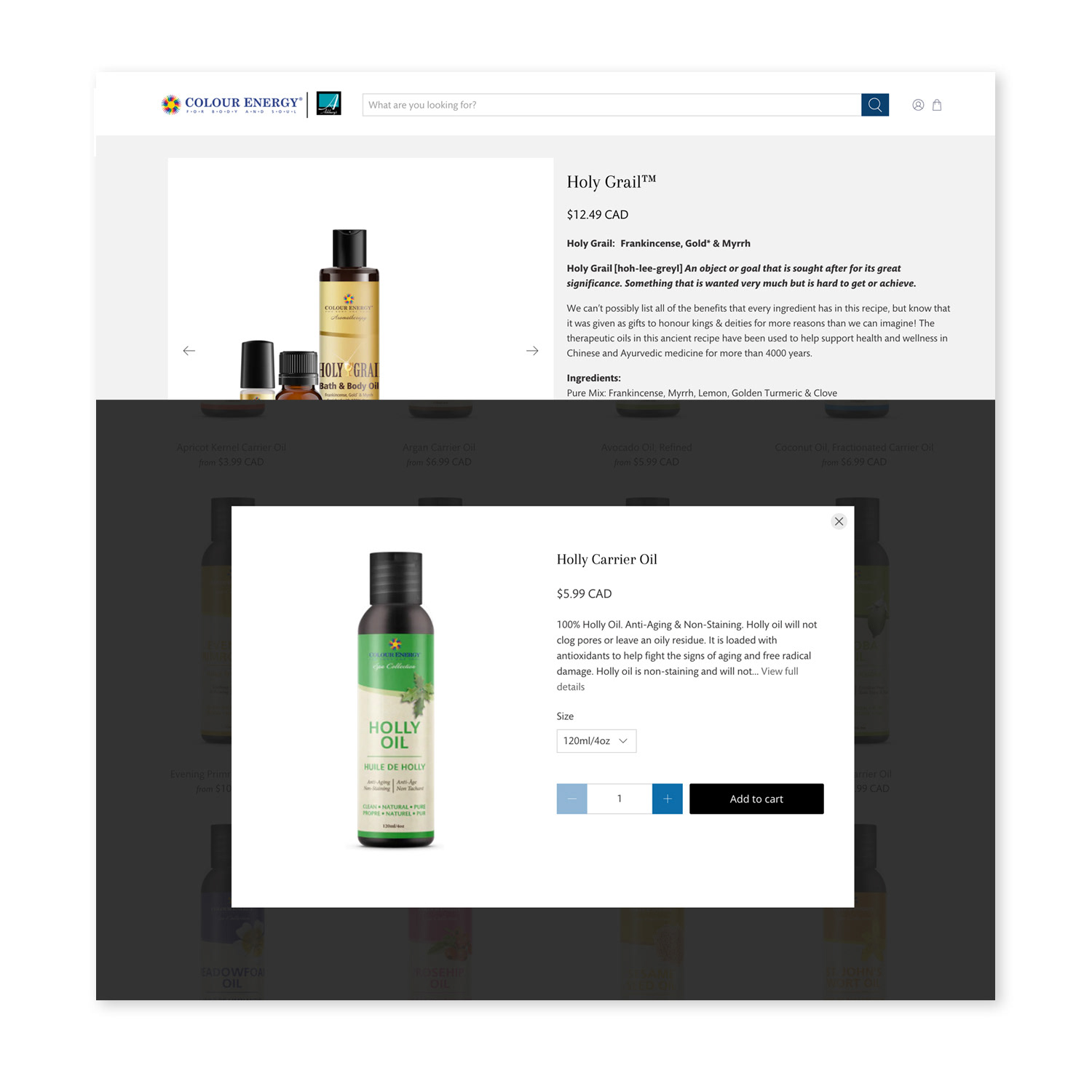
Using content management systems such as Shopify and Wordpress, I executed and sustained websites for 4 sister companies, maintaining usability through consistent layout, good navigation and strong call-to-actions. As the UX/UI designer, I defined the user experience and was responsible for creating wireframes focusing on space allocation, prioritization of content, functionalities available, and intended behaviours.
Using Shopify and a third party payment processing solution, I set-up recurring payments by adding pay-pal, credit-card and debit functions which were integrated with the accounting system. I created a responsive designed, full e-commerce platform with a search function, improved navigation and product promotion. I updated websites, created tailored, personalized content for emails, used descriptive titles, alt tags and named the images appropriately for maximum organic search results.
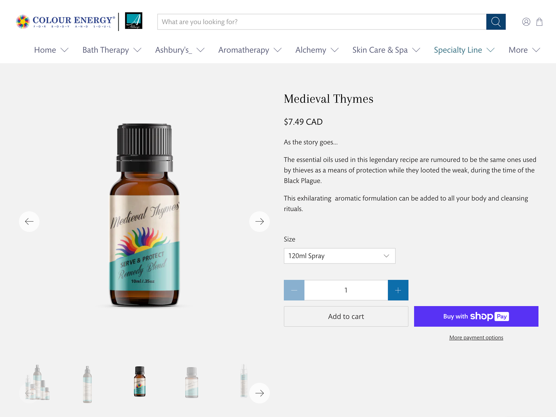
I created and managed the online stores for wholesale and direct to consumer (colourenergyshop.com). I made the website product mock-ups using Adobe Photoshop, gathered the product descriptions, prices and sizes and placed the information in Shopify and Wordpress.
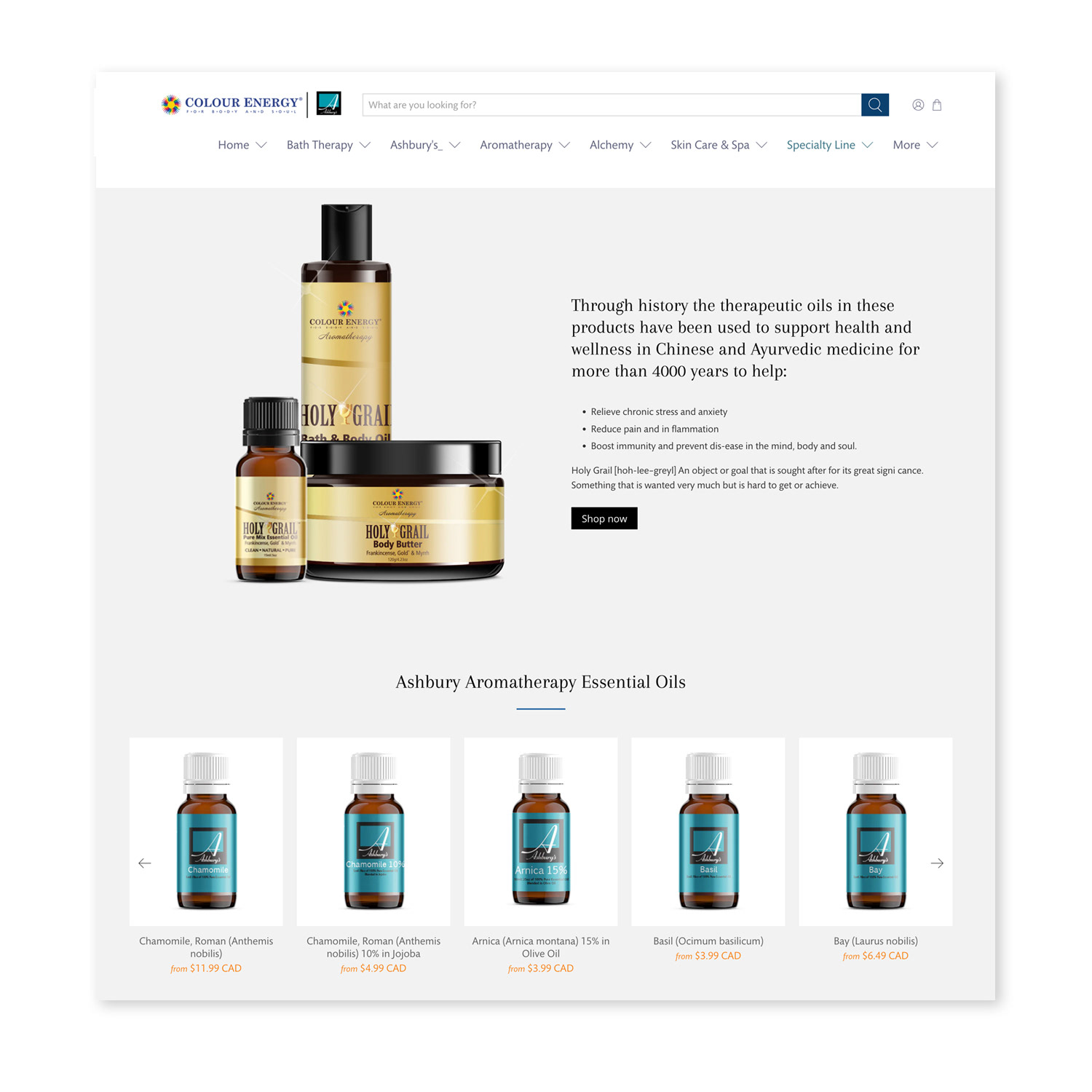
Colour Energy Shopify Site
Colour Energy Shopify Site
Colour Energy Shopify Site
Social Media Design
Creating Dynamic Presence
Organic Static & Animated Social Media Assets
Creating Dynamic Presence
Organic Static & Animated Social Media Assets
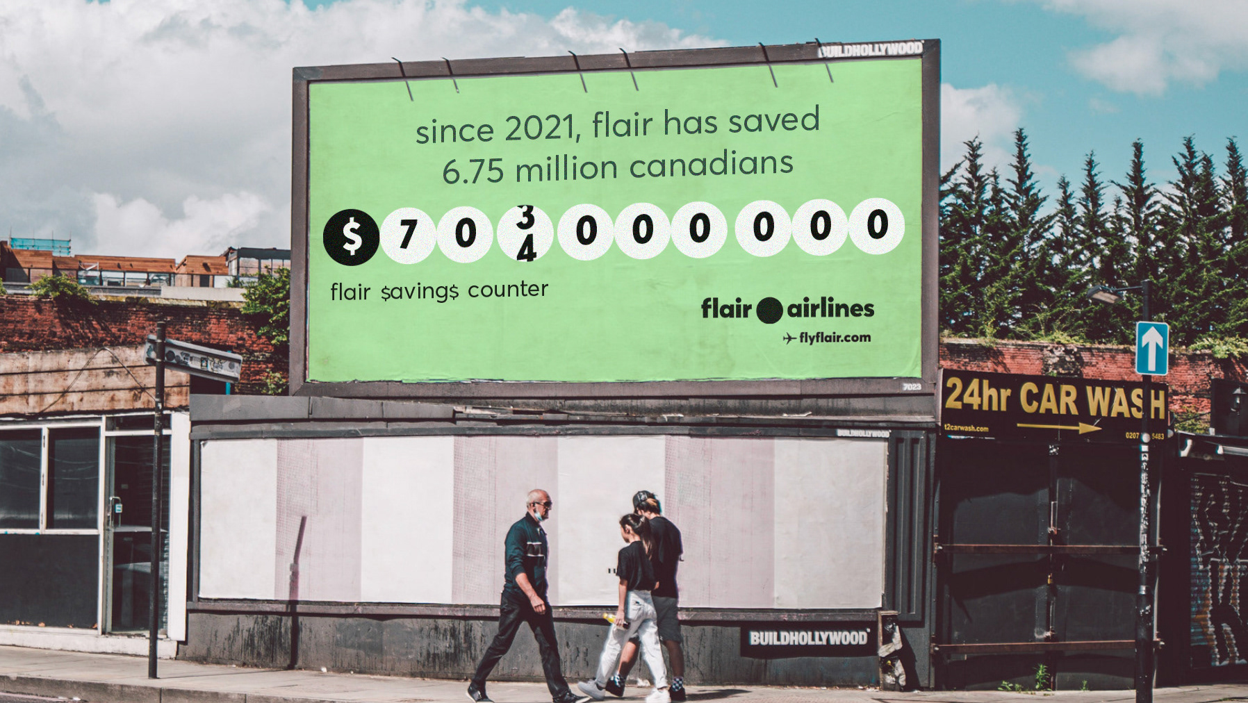
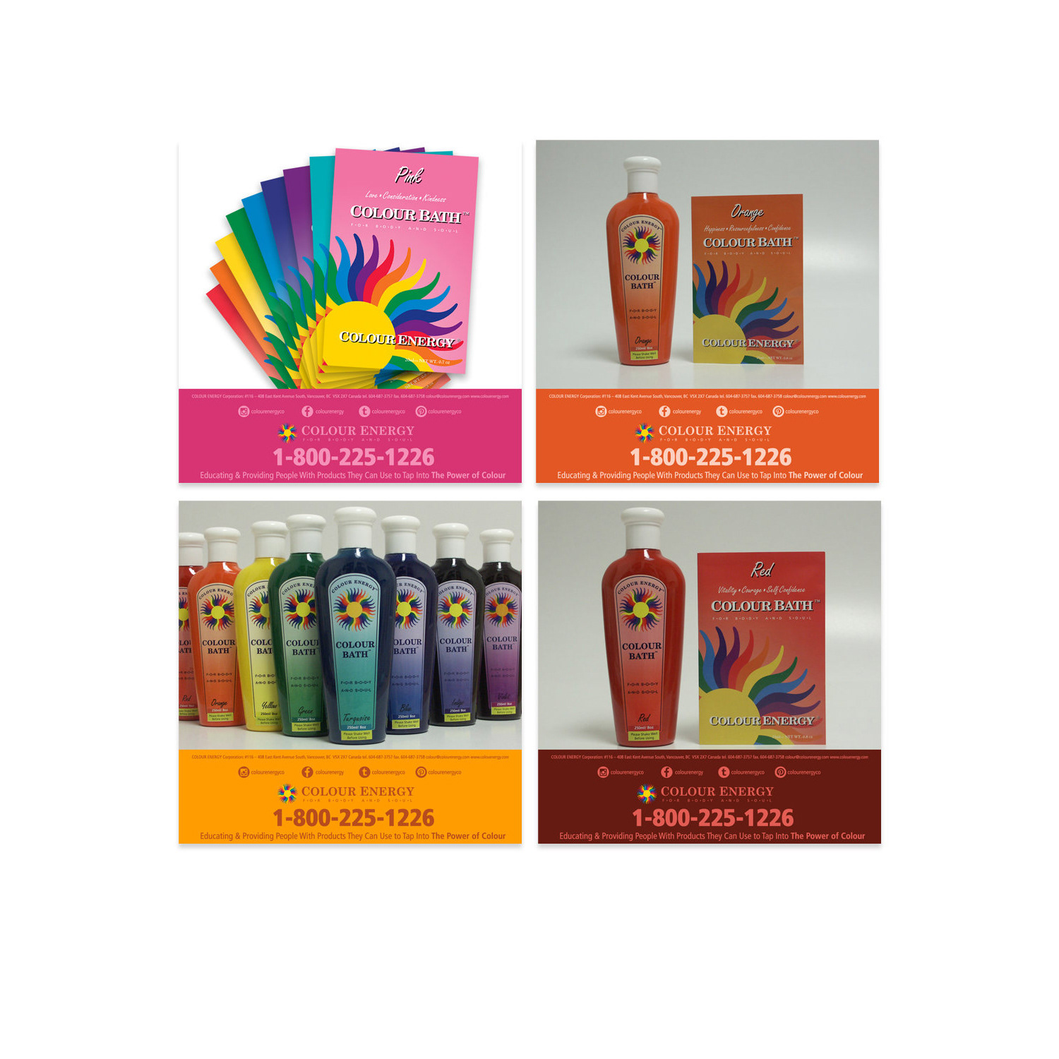
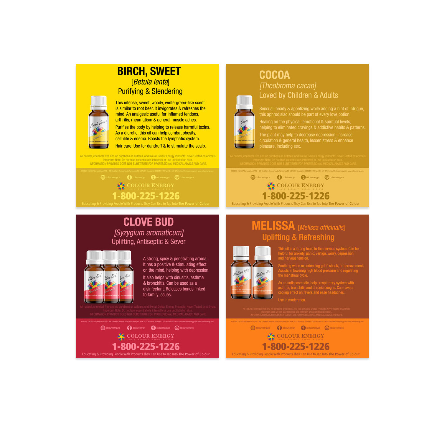
I orchestrated a cohesive social media strategy across five channels, optimizing their presence on various platforms. By setting up accounts and crafting visually compelling graphics, I enhanced brand visibility and engagement. My tailored approach to ads and graphics bolstered performance metrics significantly: Facebook engagement surged by 250%, post reach expanded by 105%, page likes grew by 150%, and video views soared by 400%.
Adhering closely to brand guidelines, I amplified brand awareness, fostering meaningful connections and expanding our customer base. My creative concepts not only drove website traffic and sales but also resonated with audiences, resulting in heightened engagement. By curating attention-grabbing images, I effectively showcased our properties and services, narrating our brand story. Additionally, I ensured consistency across platforms by designing banners of varying sizes and maintaining brand coherence in image selection and asset creation.
Print Design
Crafting Comprehensive Catalogues
From 100+ Page Print to Interactive PDF Experiences
Crafting Comprehensive Catalogues
From 100+ Page Print to Interactive PDF Experiences
Successfully spearheaded the annual design and production of a comprehensive 100+ page catalogue, fostering strong partnerships with printers and suppliers. Leveraging a deep expertise in typography and a profound understanding of traditional print media, I adeptly managed self-imposed schedules, consistently meeting stringent deadlines and advancing initiatives with minimal supervision.
This catalogue seamlessly integrated into Colour Energy's overarching marketing blueprint, distributed to wholesale distributors via mail and readily available at the head office. Serving as a tangible touchpoint, it continuously reinforced brand recognition and inspired customer engagement offline. Concurrently, I enhanced our annual publication by creating interactive PDF versions on our website, complete with intuitive table of contents tabs for streamlined navigation.
Print Design
Tailored Pricing Strategies
Exclusivity for Targeted Customers
Exclusivity for Targeted Customers
We meticulously crafted three unique price lists: one in Canadian dollars, another in US dollars, and a specialized list dedicated to Ashbury's Aromatherapy. Recognizing the volatile nature of essential oil prices, we refrained from embedding them directly within the catalog. Instead, we developed in-house printed price lists, prioritizing flexibility and effortless updates. This strategy was indispensable, accommodating both wholesale and retail pricing structures and delivering customized rates for a broad spectrum of customers.
Print Design
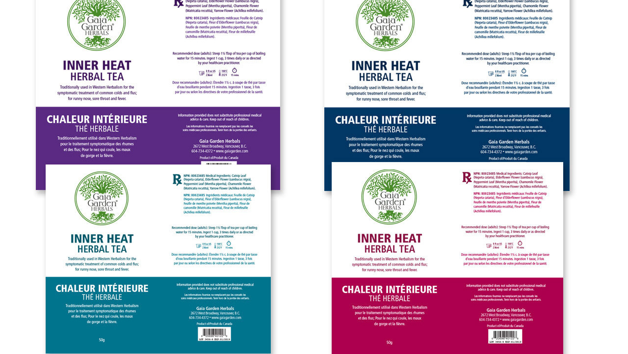
Corporate Product Labels
Labeling Excellence for Corporate Products
Corporate Product Labels
Labeling Excellence for Corporate Products
I designed an extensive range of corporate labels and inserts for a diverse lineup of holistic and all-natural products within the Colour Energy brand, ensuring each product received a unique and compelling visual identity that resonated with our customers.
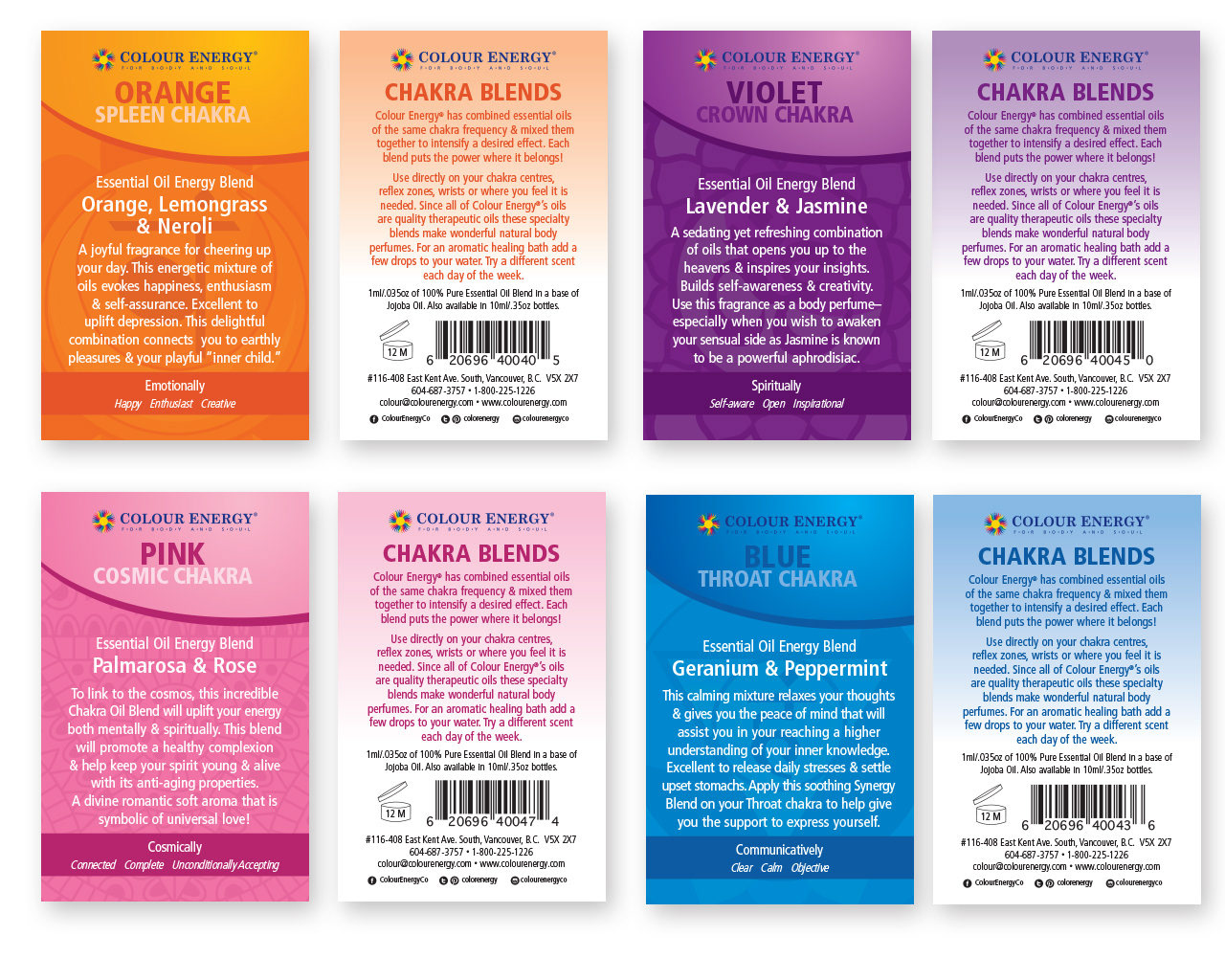
Colour Energy Packaging
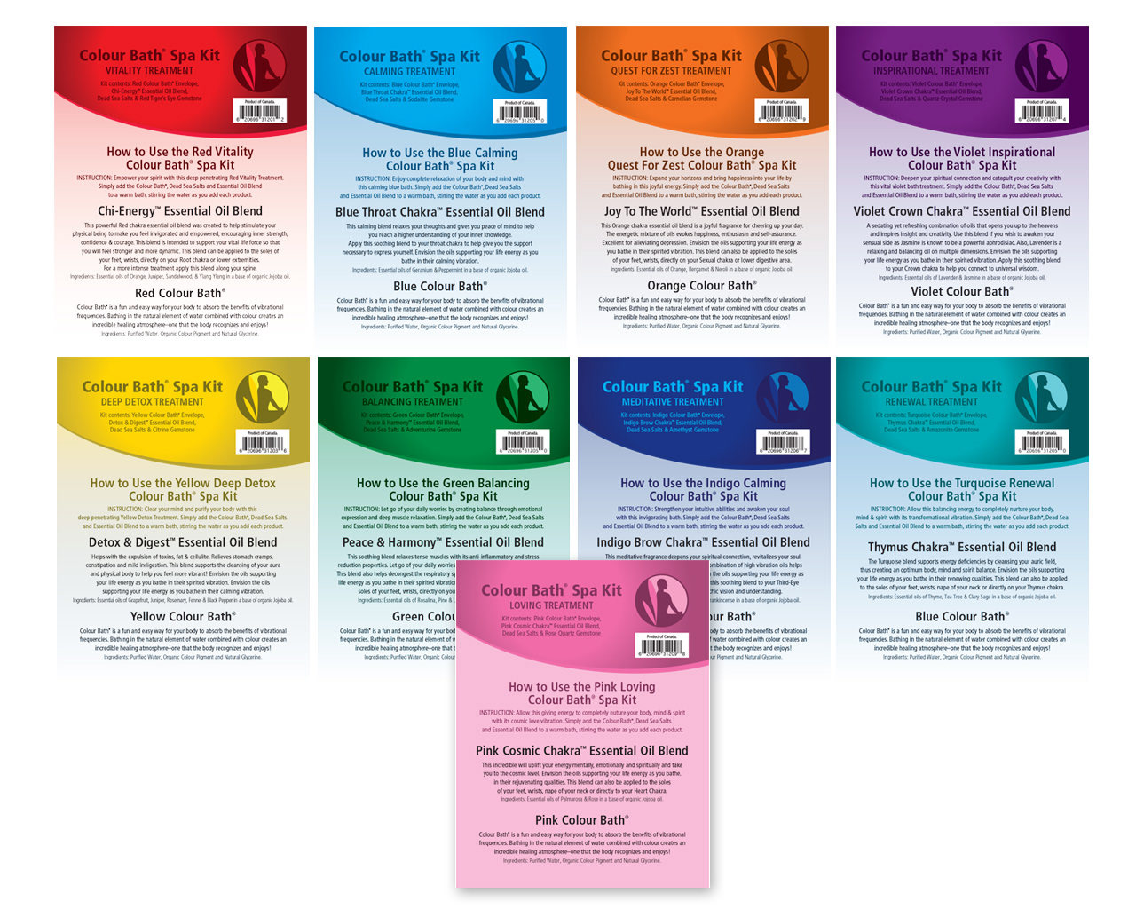
Colour Energy Packaging
Print Design
Mastering Packaging Excellence
Captivating Buyers & Elevating Product Appeal
Mastering Packaging Excellence
Captivating Buyers & Elevating Product Appeal
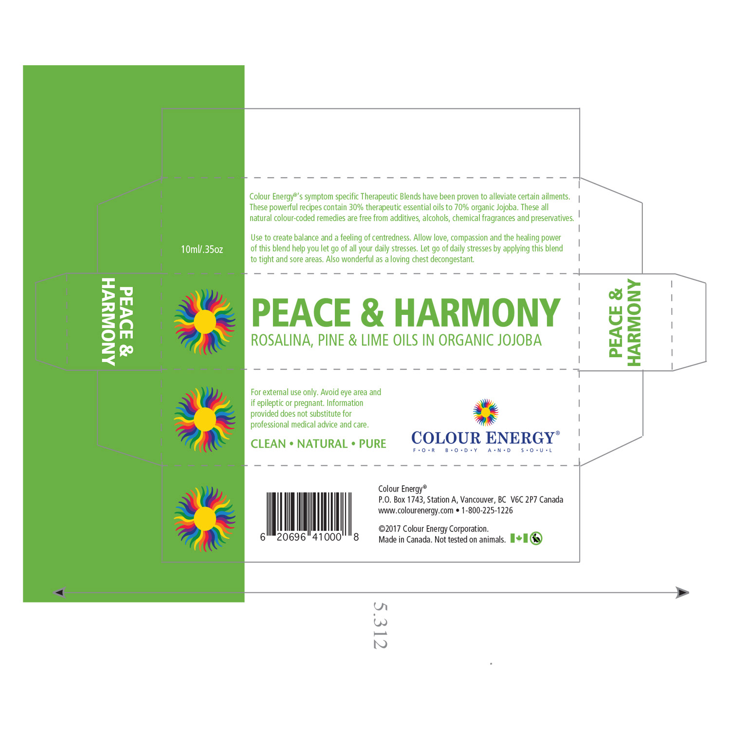
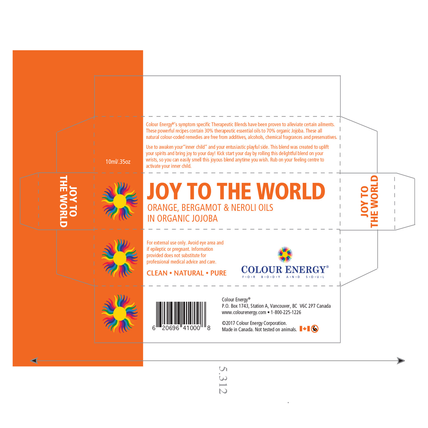
In my capacity, I spearheaded tailored packaging solutions for new product introductions, aiming for a captivating initial impact and heightened customer interaction. I invested attention in designing box art and labels, emphasizing both visual allure and essential protective attributes, particularly considering the vulnerability of essential oils to light and temperature fluctuations.
Working hand-in-hand with printers and distributors, I crafted packaging that seamlessly protected the product while eloquently conveying its intrinsic value. By harmonizing consumer-focused design, operational efficiency, and crucial information presentation, I consistently produced packaging that aligned with brand aspirations and exceeded consumer anticipations.

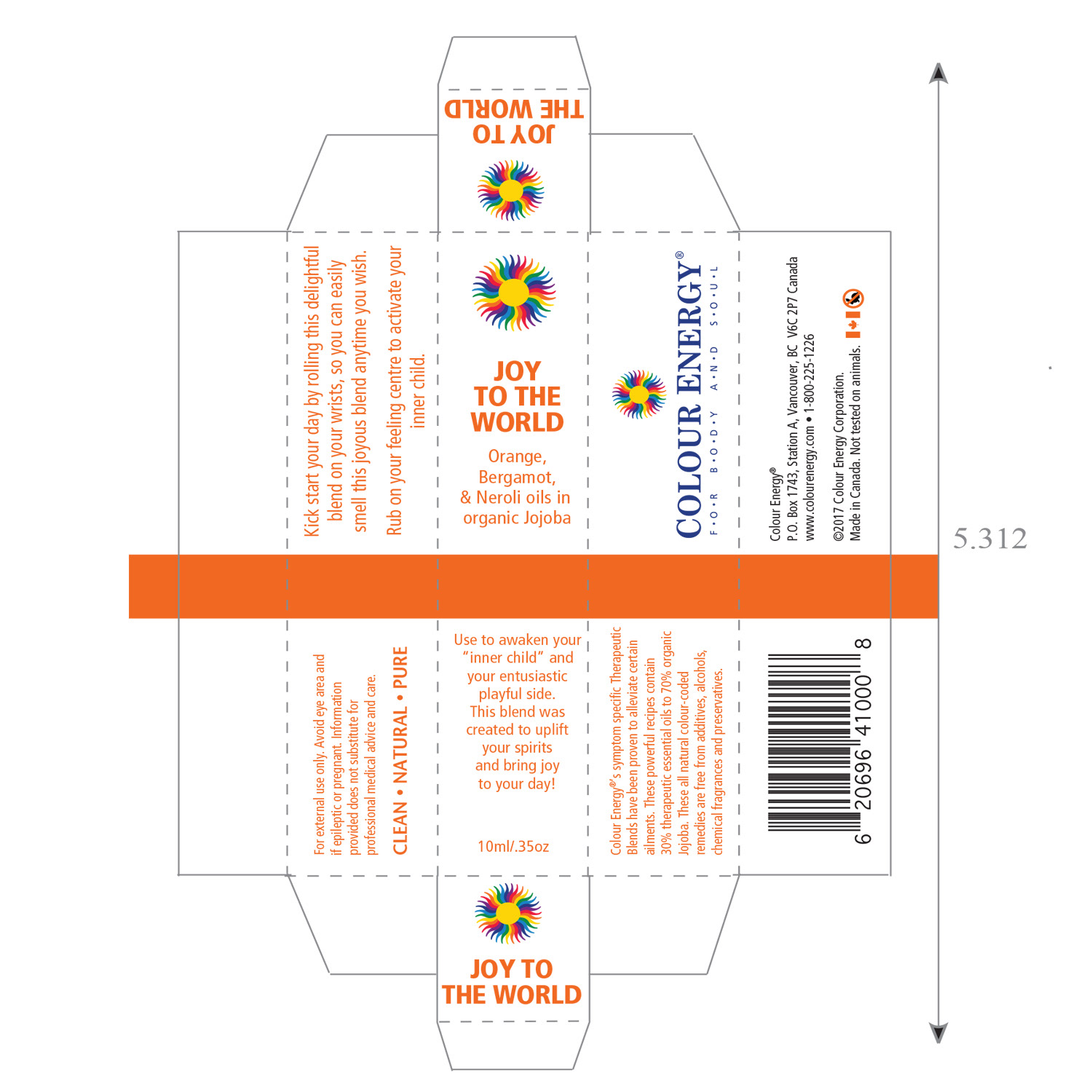
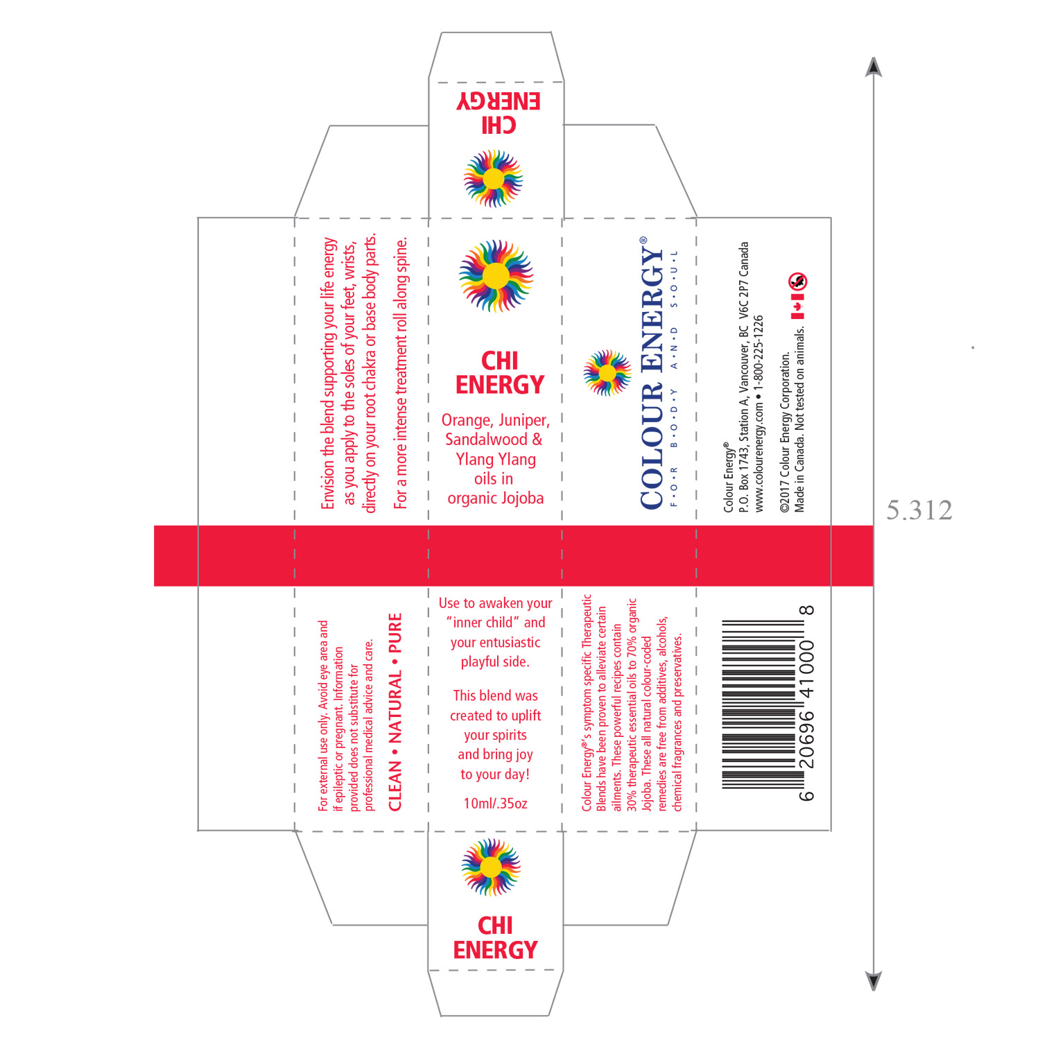

Print Design
White-Labelling Mastery
One Brand, Our Expertise: White-Labelling Excellence
White-Labelling Mastery
One Brand, Our Expertise: White-Labelling Excellence
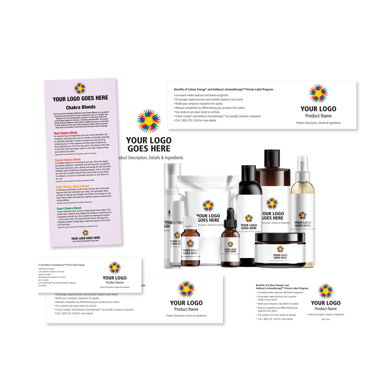
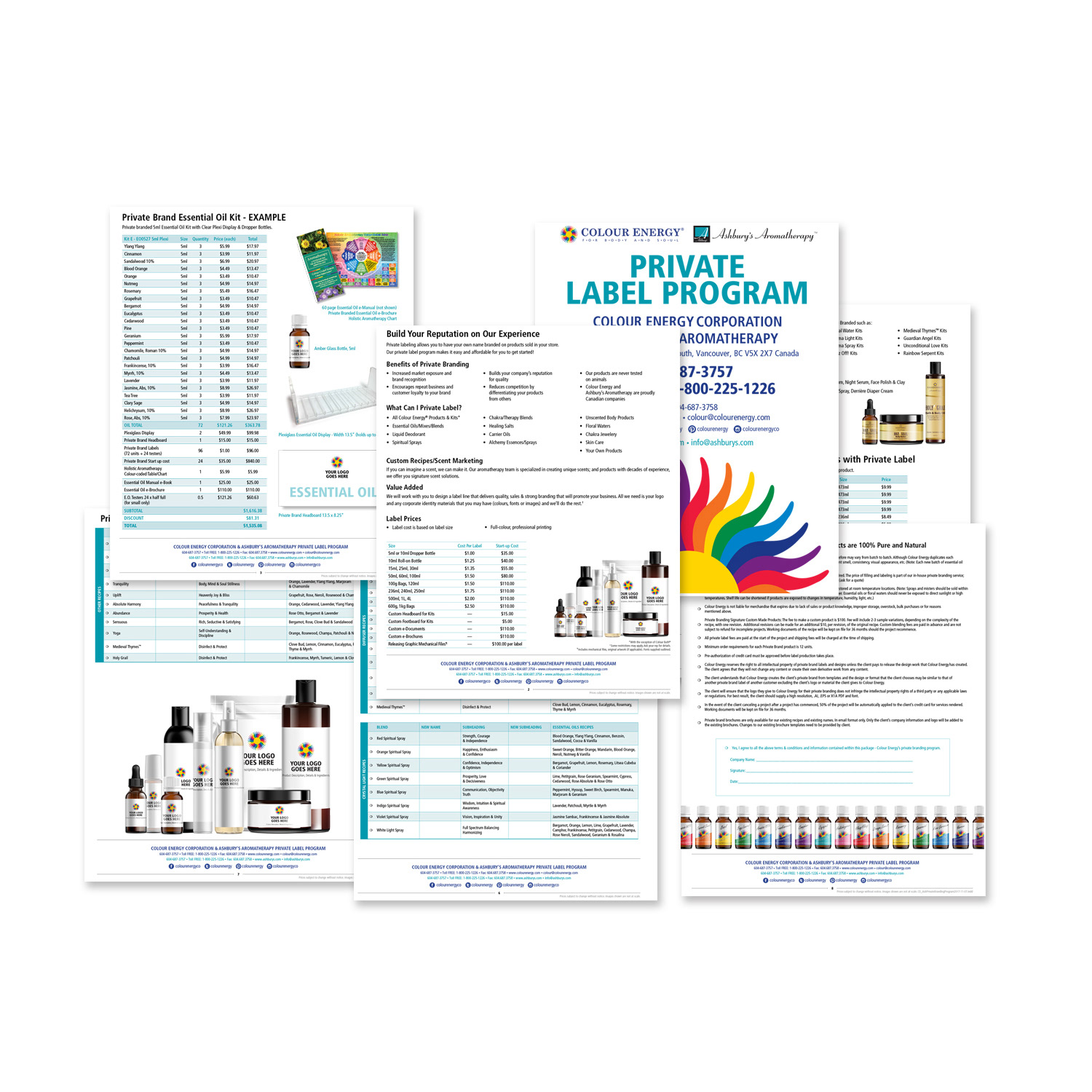
At Colour Energy, we stand proudly at the forefront of the esoteric wellness sector, setting the standard for excellence in white-labelling. Our unwavering commitment to quality and innovation is evident in our seamless coordination of extensive marketing campaigns and our meticulous oversight of product production, all catering to a diverse clientele with varying needs and preferences.
Our dedication extends beyond product creation and marketing. To empower our Sales team in effectively conveying the unique value of our offerings to potential clients, we go the extra mile. We delve into the details, meticulously crafting comprehensive reports that highlight the benefits and advantages of our solutions. We also create captivating mock-ups that vividly showcase the potential of our products, allowing clients to visualize the transformative experiences they can offer.
But we don't stop there. Recognizing the importance of a well-rounded approach, we develop an array of sales assets. These resources serve as invaluable tools in our Sales team's arsenal, providing them with the means to engage, educate, and inspire our clients. At Colour Energy, we are committed to excellence at every step of the journey, ensuring that our clients receive not only exceptional products but also the support and resources they need to thrive in their endeavours.
Colour Energy White Label Program
Colour Energy White Label Program
Print Design
White-Labelling Mastery
Transforming Packaging & Marketing for Authentic Branding Illusion
White-Labelling Mastery
Transforming Packaging & Marketing for Authentic Branding Illusion
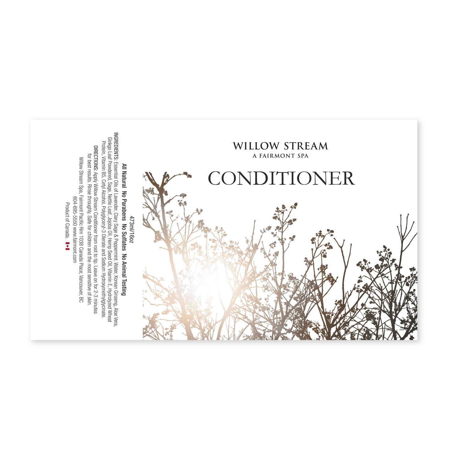
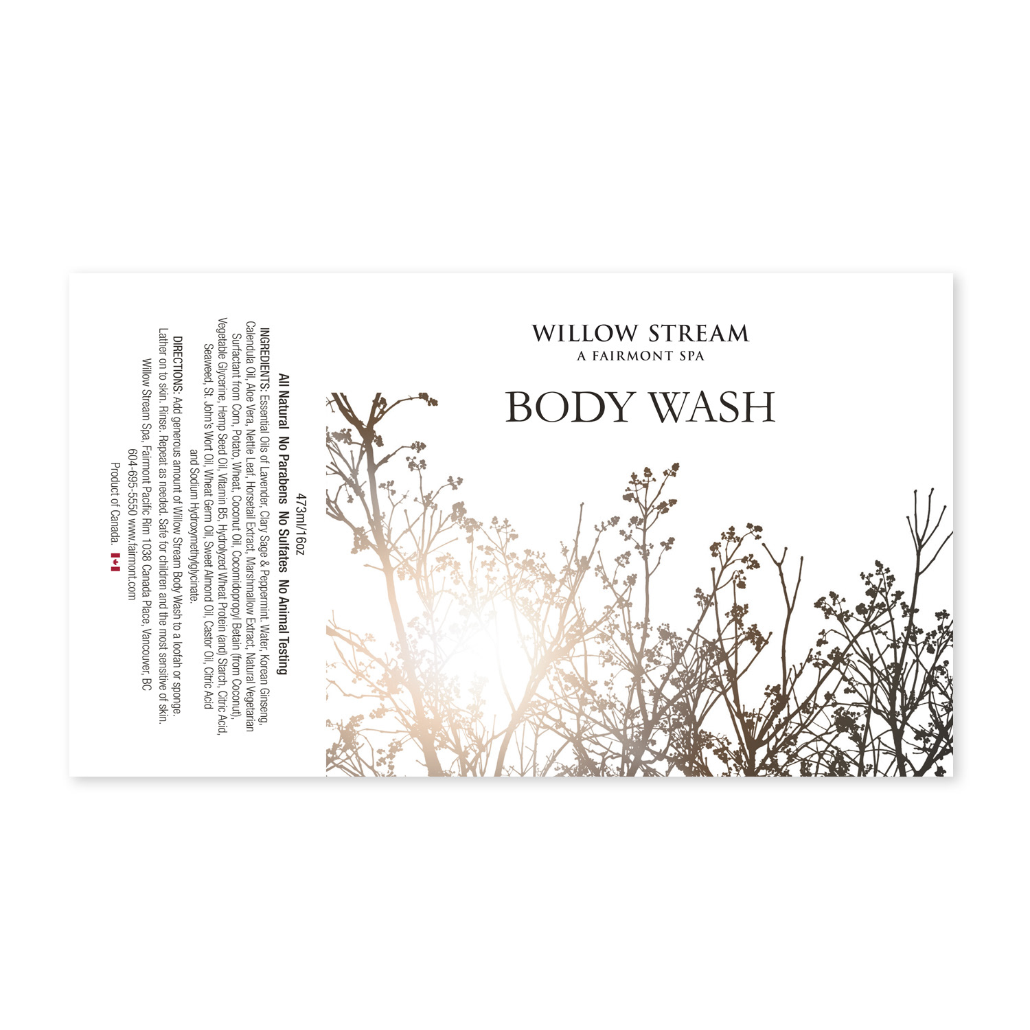
Colour Energy stands at the forefront of white-labelling in the esoteric wellness sector. We orchestrated comprehensive marketing campaigns and managed product production for a diverse clientele including spas, tanning salons, hotels, yoga studios, health stores, and spiritual practitioners. Each campaign culminated in products distinctly branded with the client's name and logo.
On occasions, I spearheaded the logo and branding design process, presenting concepts to stakeholders and seamlessly integrating approved branding across products and marketing initiatives. My responsibilities encompassed the creation of packaging, labels, and product mock-ups. I designed bespoke product labels pivotal for establishing brand identity and differentiation, ensuring they were both cost-effective and professional to drive sales growth. Leveraging Adobe Illustrator, I consistently crafted packaging and labels that upheld brand integrity, emphasizing meticulous font and colour coordination.
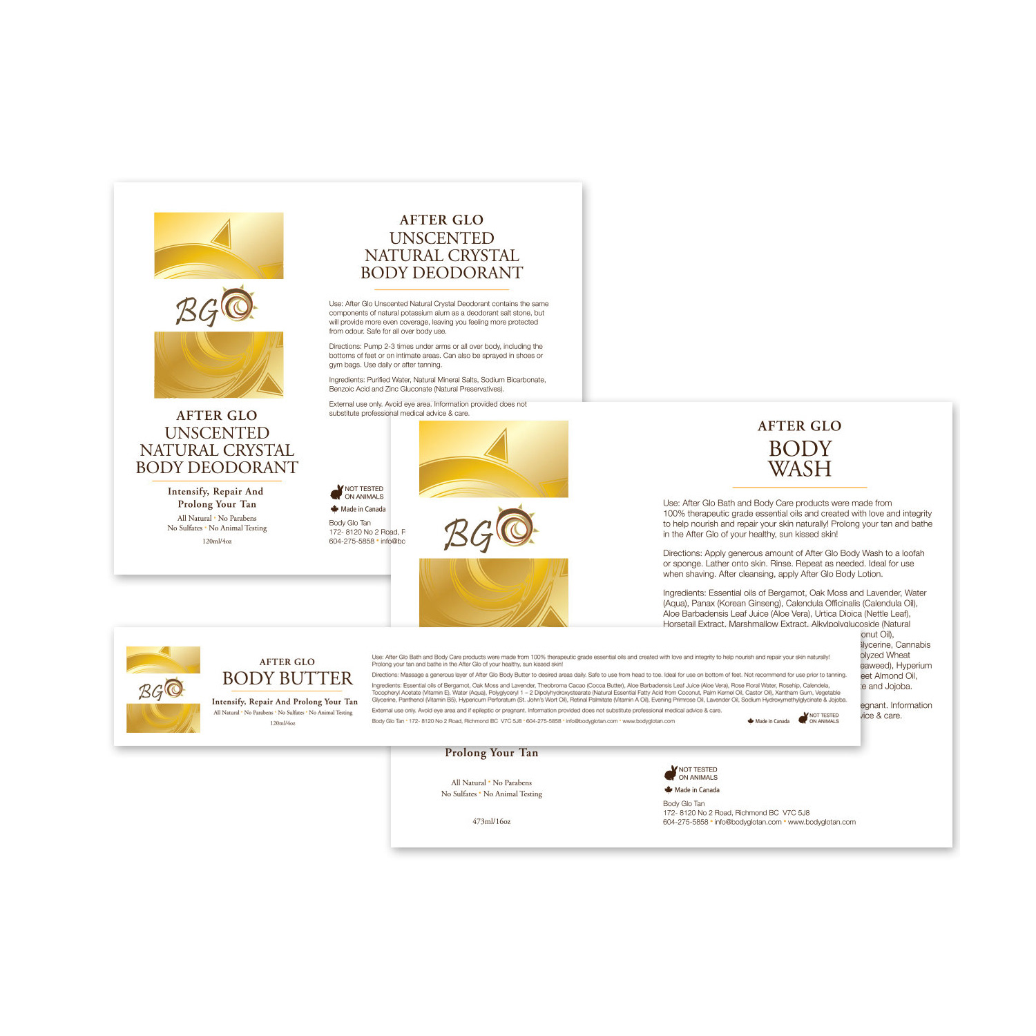
White Label Example
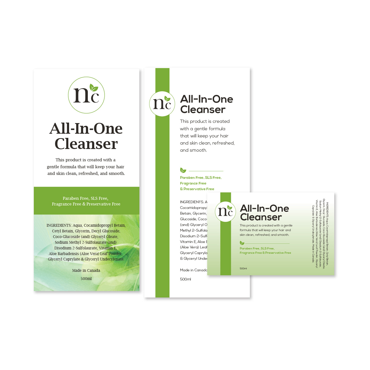
White Label Example
Campaign Design
Holy Grail Product Launch
Orchestrating Branding & Marketing for a Stellar Product Launch
Holy Grail Product Launch
Orchestrating Branding & Marketing for a Stellar Product Launch
Colour Energy unveiled its latest product line, 'Holy Grail,' blending Frankincense, Turmeric, and Myrrh essential oils. Responding to the client's vision of an emblem featuring a goblet and gold hues, I selected a distinctive font to set the product apart. Incorporating a luxurious gold leafing effect on the labels solidified a memorable brand identity. My contributions spanned the creation of the logo, icon, labels, box inserts, posters, handbills, dedicated emails, website assets, product mock-ups, and social media content. Additionally, I spotlighted the product line in the monthly corporate newsletter and enriched the corporate catalog with a prominent full-page advertisement.
Campaign Design
Mother Nature Unveiling
Transforming the Former 'Buzz-off' into a New Brand Identity
Mother Nature Unveiling
Transforming the Former 'Buzz-off' into a New Brand Identity
Colour Energy proudly introduced their latest offering – Mother Nature Aromatherapy, an essential oil blend designed to repel insects. In my role as the Senior Graphic Designer, I spearheaded the crafting of a distinctive brand identity for their new bug repellent products. Presenting attention-grabbing logo options, I ensured a powerful first impression during stakeholder reviews.
The icon, symbolizing outdoor experiences, featured a tree, aligning seamlessly with the product's name. Crafting custom product labels, I prioritized building a strong brand identity, achieving distinctiveness, and fostering sales growth with a professional yet cost-effective approach.
Campaign Design
Colour Energy Skincare Debut
Crafting Distinctive Product Labels for Brand Identity Excellence
Colour Energy Skincare Debut
Crafting Distinctive Product Labels for Brand Identity Excellence
Colour Energy introduced a fresh skincare line, for which I meticulously crafted the branding, opting for a refreshing shade of blue to evoke a sense of vitality and freshness. The custom product labels I designed played a pivotal role in establishing a distinct brand identity. By ensuring a blend of professionalism and affordability, these labels significantly contributed to our sales growth. Additionally, I extended the branding to include box inserts, posters, handbills, dedicated emails, and social media posts.
Campaign Design
Medieval Thymes Initiative
Orchestrating Branding & Marketing Assets for E-commerce Site Launch
Medieval Thymes Initiative
Orchestrating Branding & Marketing Assets for E-commerce Site Launch
Colour Energy unveiled its latest offering, 'Medieval Thymes,' a potent blend of essential oils designed to disinfect surfaces. As a key contributor, I crafted a comprehensive suite of assets, including labels, box inserts, posters, handbills, dedicated email campaigns, website assets, product mock-ups, and engaging social media posts. Notably, I highlighted the product line in the monthly corporate newsletter and curated updates for the company catalogue.
Visual Design
Email & Print Newsletter
Amplifying Colour Energy's Corporate Vision & Objectives
Email & Print Newsletter
Amplifying Colour Energy's Corporate Vision & Objectives
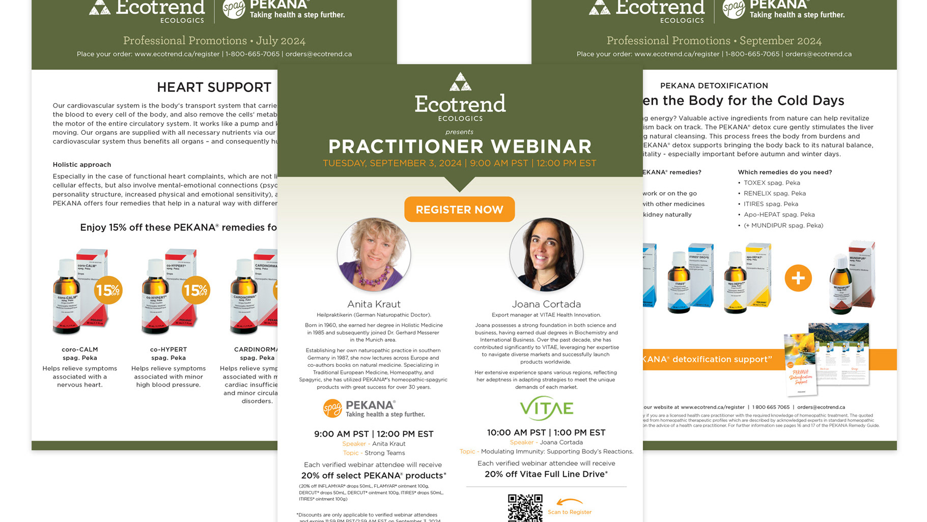
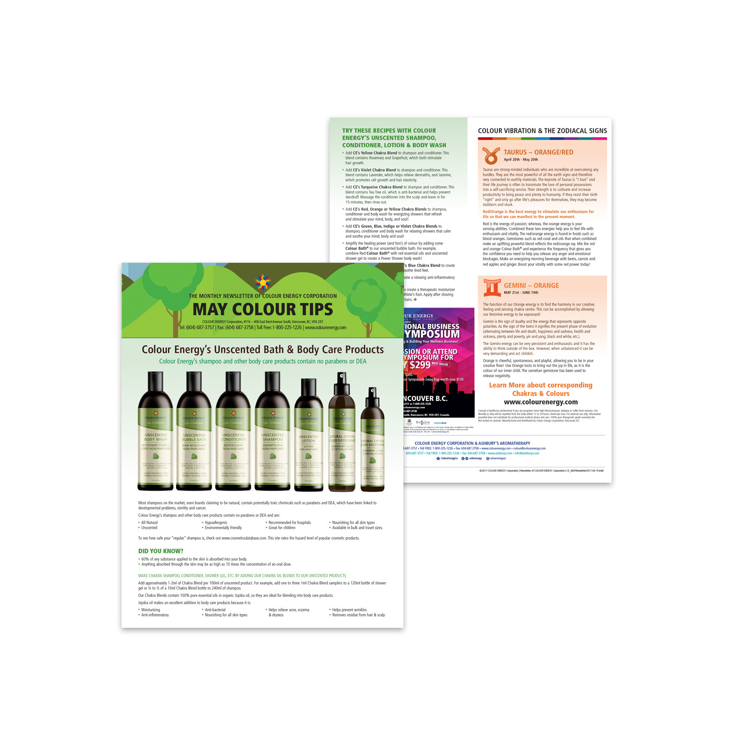
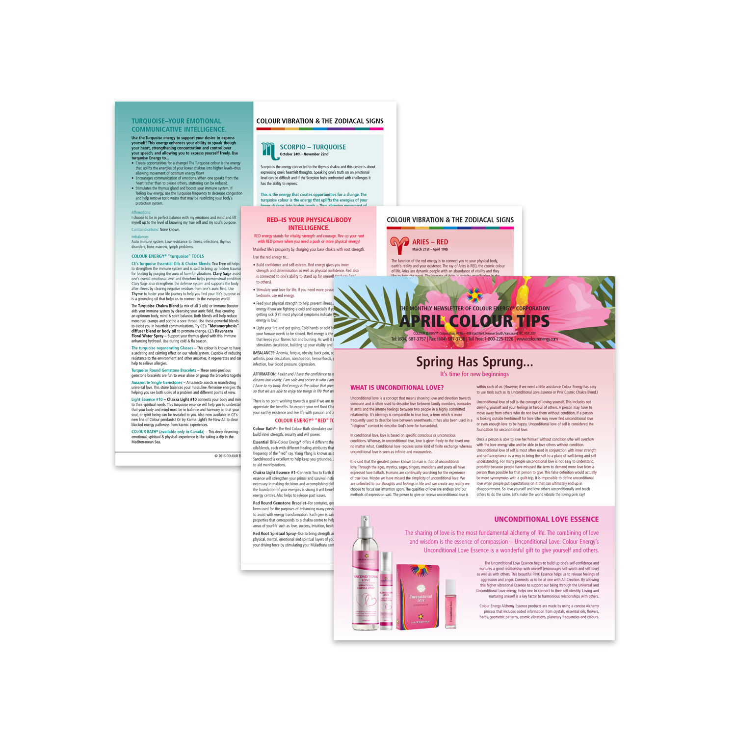
I revitalized the monthly client newsletter, infusing it with a refreshed aesthetic that featured intuitive navigation icons, prominent social media links, enriched imagery, and dedicated ad spaces spotlighting Colour Energy's overarching corporate objectives. Throughout my tenure, I revamped the print newsletter template using Adobe InDesign, streamlining its design and infusing contemporary elements through strategic use of icons and colour palettes.
My responsibilities extended to curating a monthly print edition, which served dual purposes: as a tangible drop-box and an interactive PDF on our website. Drawing insights from these newsletters, I conceptualized and designed corresponding social media assets tailored for each month, encompassing horoscopes, monthly promotional campaigns, and unveiling of new products.
Visual Design
Product Factsheets & Promo Assets
Informative Collaterals Highlighting Services & Benefits
Product Factsheets & Promo Assets
Informative Collaterals Highlighting Services & Benefits
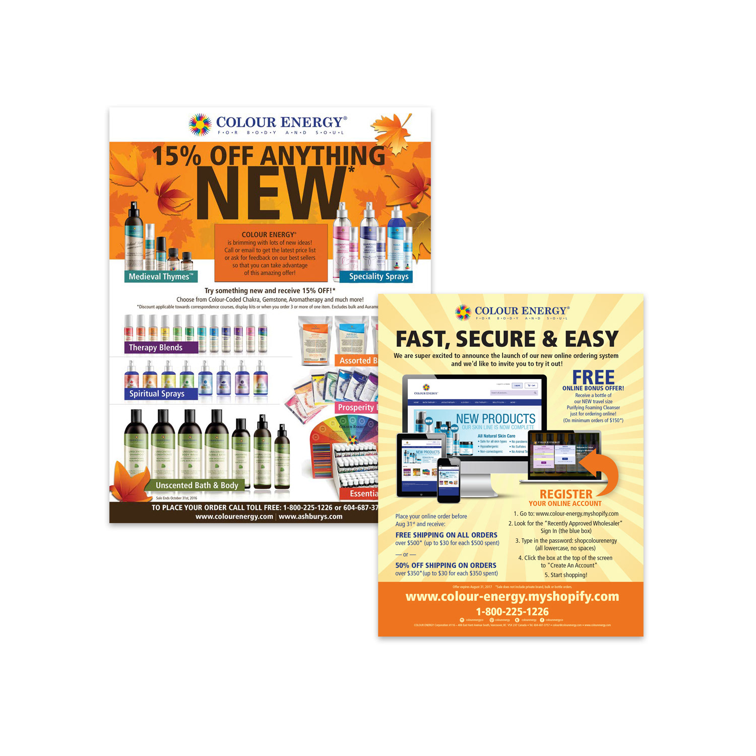
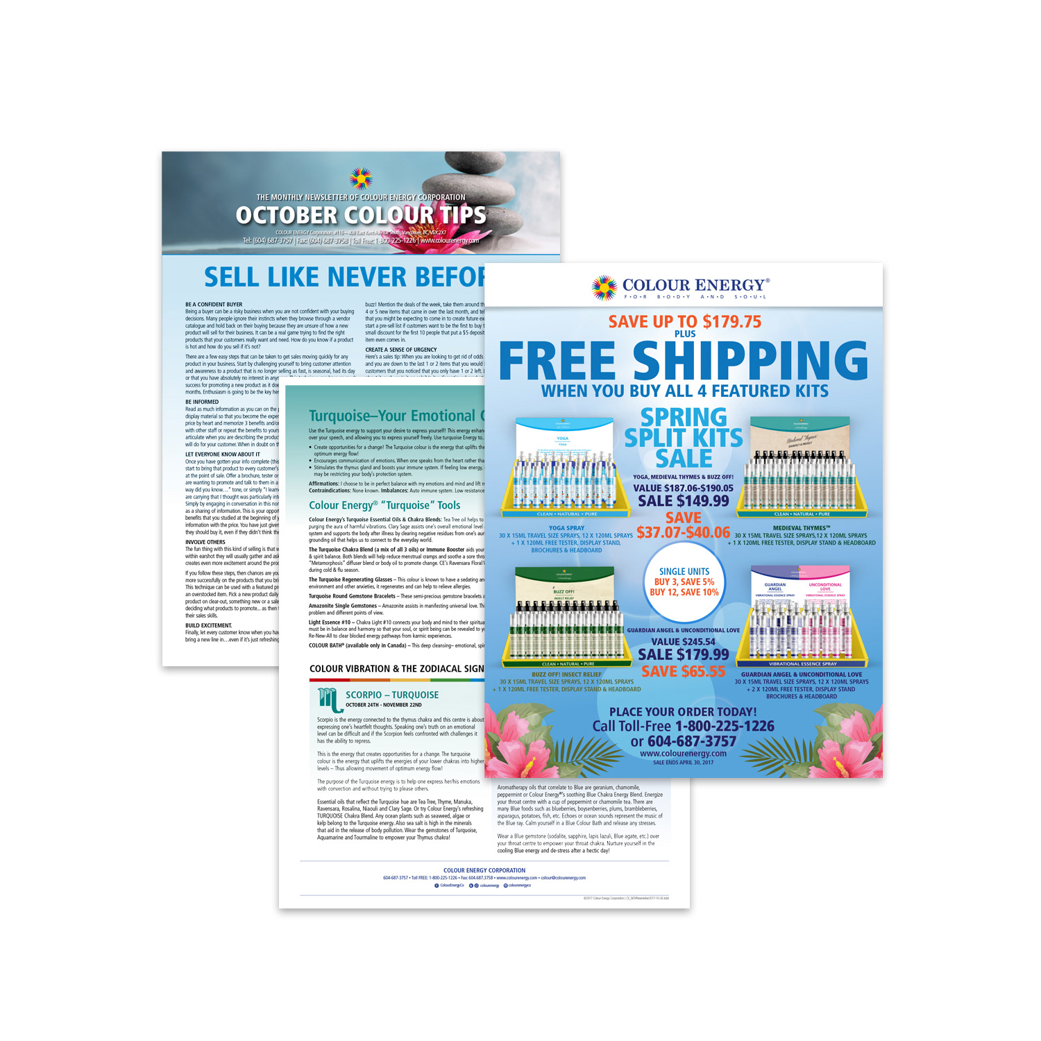
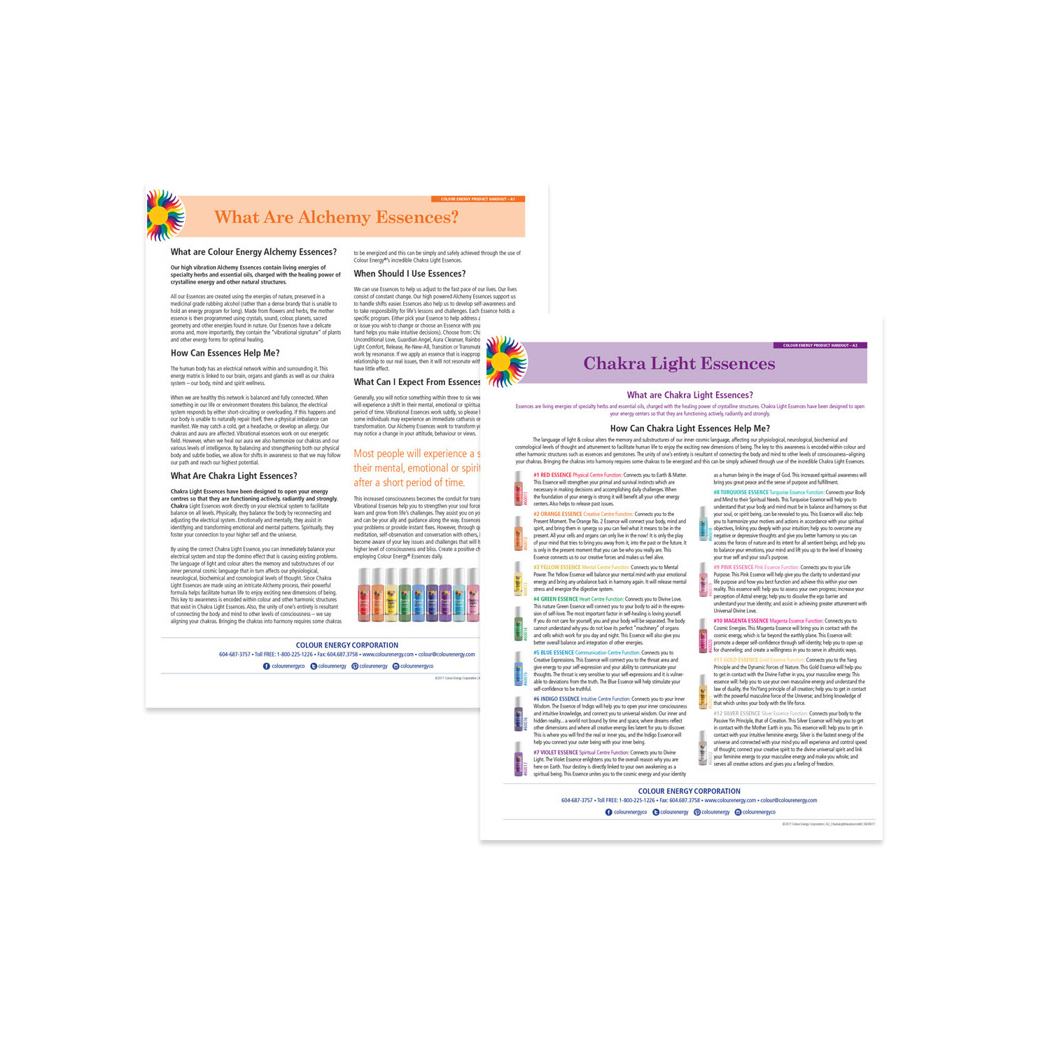
Colour Energy's core mission is to empower individuals through products that leverage the transformative influence of colour, fostering holistic well-being for the body, mind, and spirit. At the forefront, I led monthly campaigns, seamlessly integrating elements like emails, website banners, social media assets, printed drop-box flyers, and insightful promotional factsheets.
Throughout my time at Colour Energy, I meticulously developed compelling fact sheets for every product, providing clients with in-depth insights into their holistic benefits and applications. Using Adobe InDesign, I crafted concise, double-sided fact sheets that prioritized clarity and impact. These materials transformed into physical drop-boxes for firsthand experiences and were also available as downloadable PDFs on our wholesaler's platform. Each fact sheet was thoughtfully designed with clear content, enhanced by product mock-ups, tables, charts, and bullet points, ensuring effortless comprehension and engagement.

Print Design
Product Creation
Crafting & Implementing a Varied Product Portfolio
Product Creation
Crafting & Implementing a Varied Product Portfolio
As a pivotal contributor to product launches, I led the creative direction, overseeing the design and development of bespoke packaging solutions that not only captivated consumers but also safeguarded the integrity of delicate products like essential oils. My expertise extended to crafting distinctive box art, labels, and protective designs, showcasing my acute attention to detail and in-depth knowledge of product preservation.
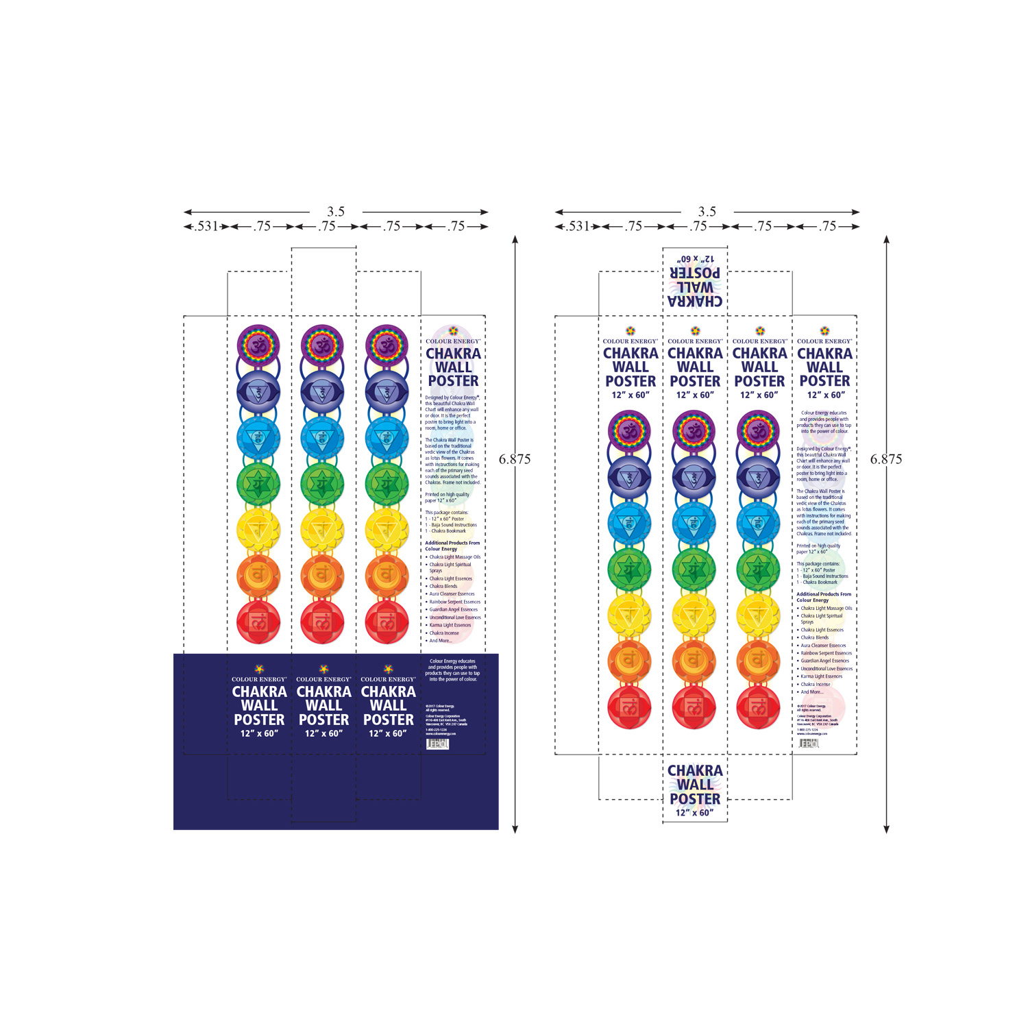
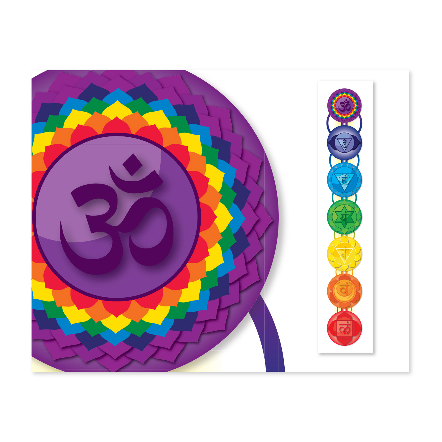
Expanding my creative horizons, I curated captivating CD label and sleeve designs for the owners' musical ventures, maintaining unwavering brand consistency and delivering high-quality visuals. In addition, I spearheaded the innovative design of a specialized chakra poster, complemented by its distinctive packaging, further underscoring my comprehensive ability to deliver impactful visual solutions across various mediums.
During my tenure at Colour Energy, I played a pivotal role in revitalizing our brand identity by meticulously updating and refining labels, inserts, and packaging. This strategic initiative ensured a cohesive and impactful brand presence, highlighting my capability to elevate and sustain brand consistency in my role as an Art Director.
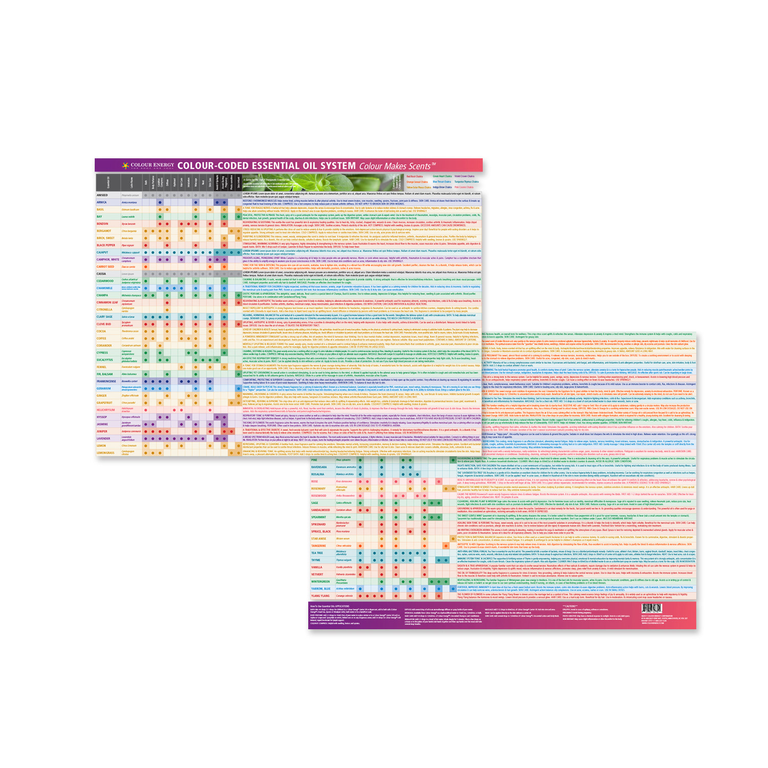
One of my standout achievements was the creation of a double-sided chart using Adobe Illustrator, illustrating the myriad benefits of essential oils. I oversaw the meticulous file preparation for printing, cultivating a productive relationship with our printer. As a result, these charts became a highly sought-after item on The Chakra Company's website, demonstrating my ability to create visually appealing and informative content that resonates with our audience.
Colour Energy Chart
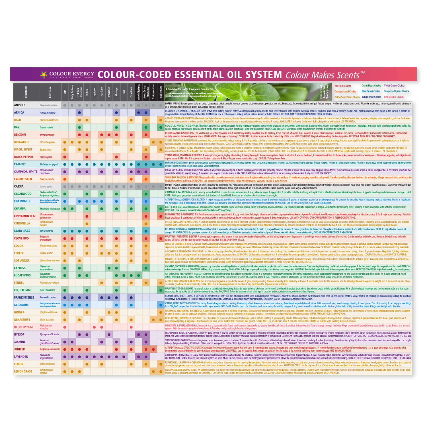
Colour Energy Chart
Social Media Design
Crystal Light Therapy Marketing
An Integral Segment of Colour Energy's Corporate Offerings
Crystal Light Therapy Marketing
An Integral Segment of Colour Energy's Corporate Offerings
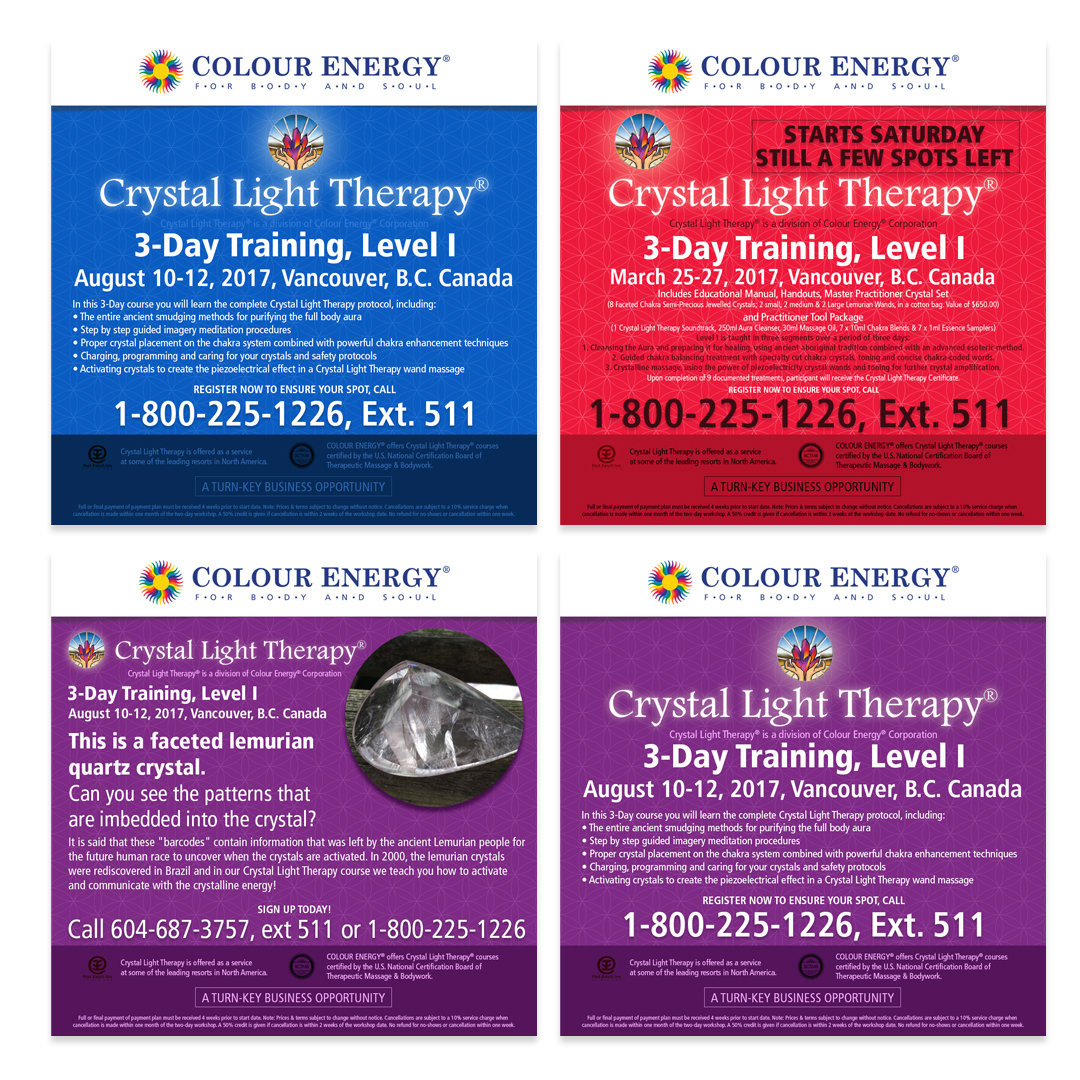
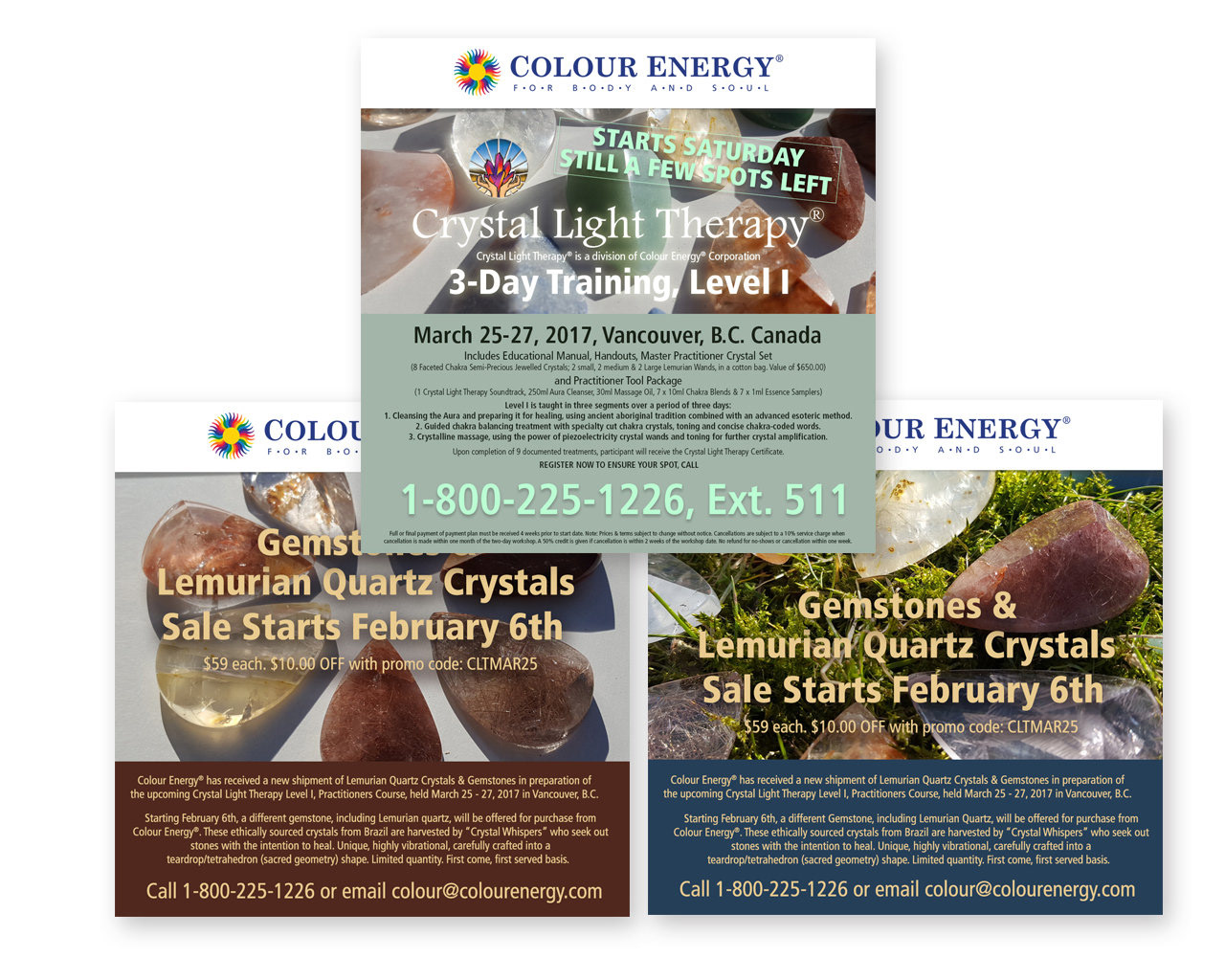
Within my role, I leveraged my art direction capabilities to spearhead the marketing initiatives for Crystal Light Therapy, utilizing strategic social media campaigns. My role extended beyond traditional marketing; it involved crafting a visual narrative that would effectively communicate the essence and benefits of this certified course.
As an Art Director, I understood the importance of creating a cohesive and visually compelling brand identity for Crystal Light Therapy. I meticulously curated imagery and design elements that resonated with the course's holistic and transformative nature. This involved not only selecting the right visuals but also ensuring that they were harmoniously integrated into our marketing materials, including social media posts, website content, and promotional materials.
Furthermore, I actively collaborated with the creative team to develop captivating visuals that captured the essence of Crystal Light Therapy, showcasing its potential to empower individuals with the knowledge and tools for healing and personal growth. Through my art direction, I aimed to evoke a sense of wonder and curiosity in our audience, compelling them to explore the course further.
My attention to detail, keen eye for aesthetics, and ability to communicate a compelling visual story played a crucial role in enhancing the overall impact of our marketing efforts. By combining strategic thinking with my artistic sensibilities, I helped ensure that the message of Crystal Light Therapy was not only heard but also deeply felt by our target audience, ultimately driving engagement and interest in this transformative practice.
Social Media Design
Chromalive Colour Light Marketing
An Integral Segment of Colour Energy's Corporate Offerings
Chromalive Colour Light Marketing
An Integral Segment of Colour Energy's Corporate Offerings
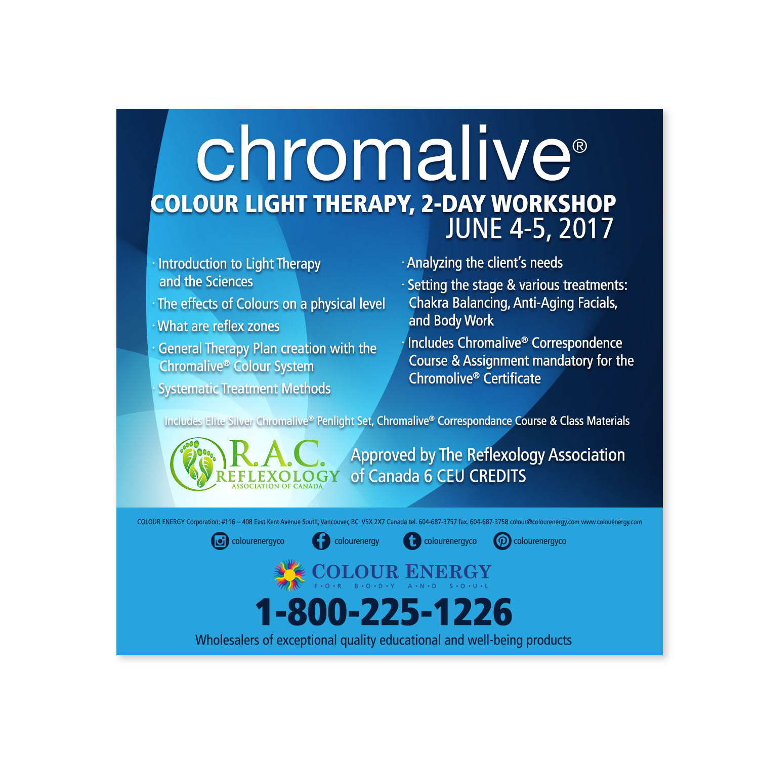
In my capacity, I took charge of the comprehensive marketing strategy for Chromalive Colour Light Therapy, harnessing the power of targeted social media campaigns and promotional activities. This specialized course, conducted at our head office, was meticulously designed to educate participants on the transformative healing potential of light. Notably, the program held the esteemed certification from the Canadian Reflexology Association, entitling participants to earn between 5-6 CEU credits, underscoring its credibility and value within the therapeutic community.

Campaign Design
Colour Energy's Colour Symposium
A Comprehensive Week-long Exploration of Light Energy Courses
Colour Energy's Colour Symposium
A Comprehensive Week-long Exploration of Light Energy Courses
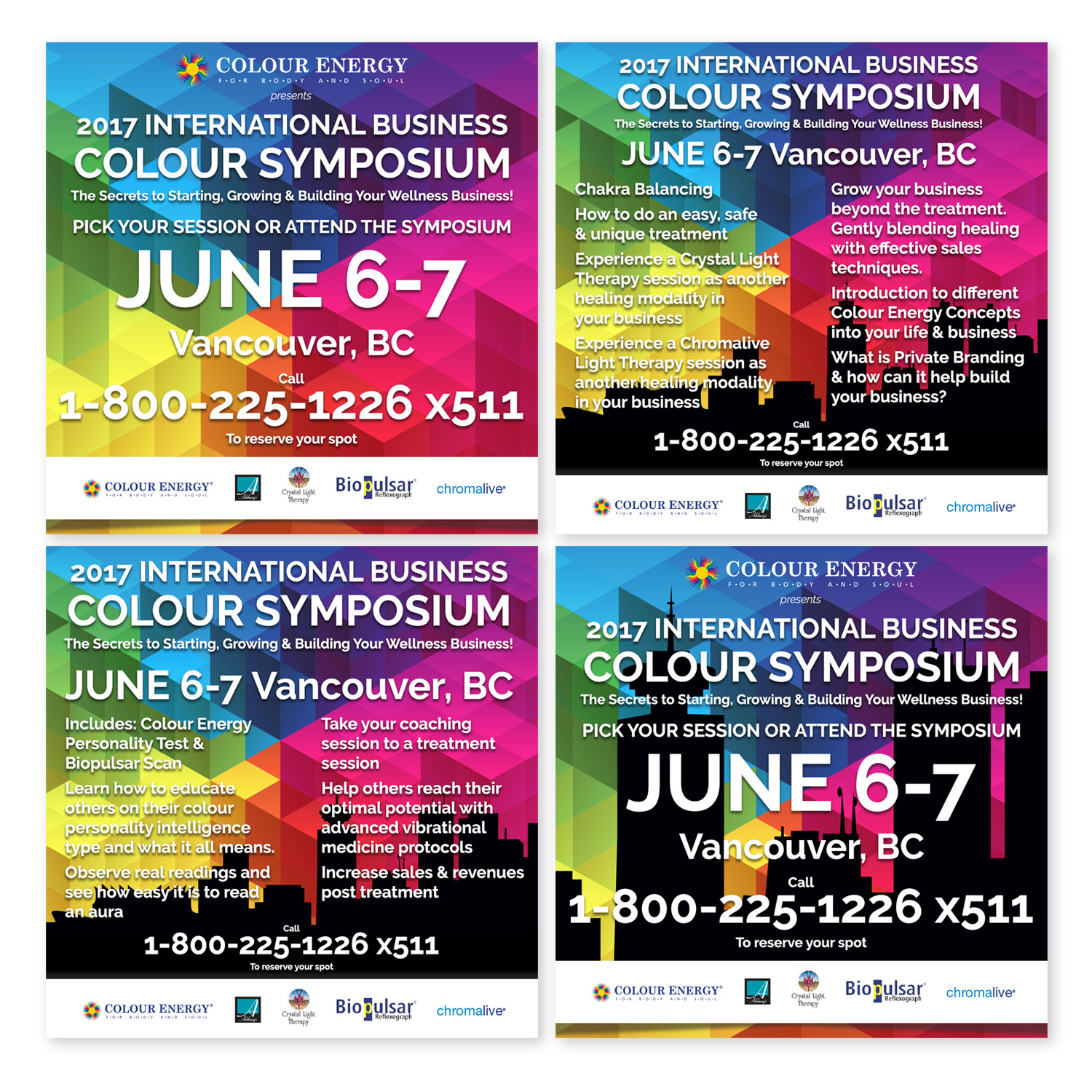
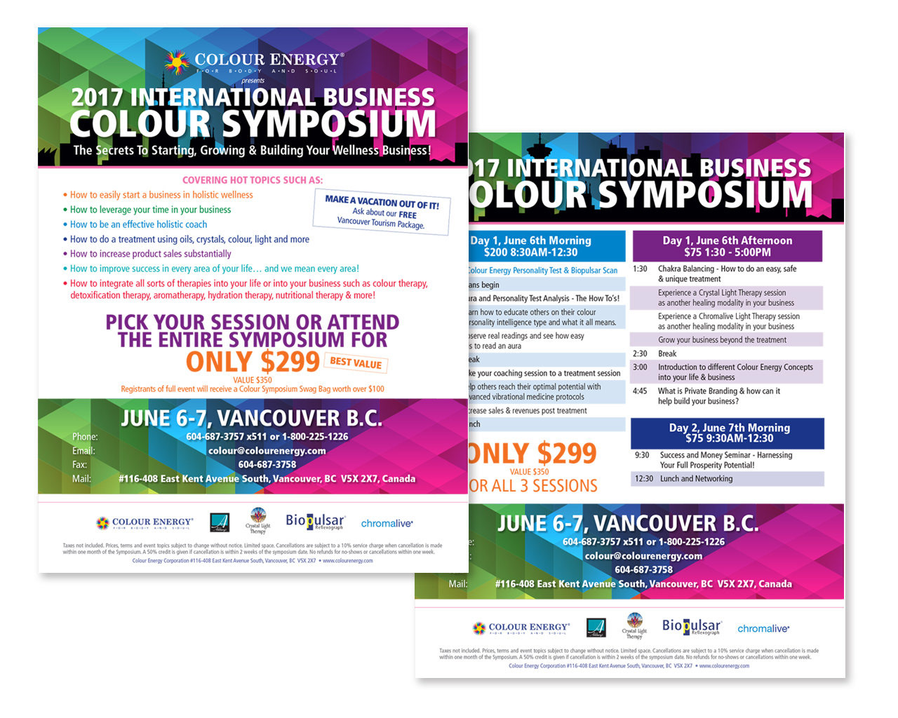
My primary role encompassed marketing the 'Colour Energy's Colour Symposium' via targeted social media campaigns and promotions. This symposium served as a holistic platform, offering attendees immersive experiences in Crystal Light Therapy, Biopulsar, Chromalive, and various other facets of holistic medicine. The overarching goal was to entice attendees to invest in the comprehensive lesson plans and associated products, providing them with a holistic understanding and hands-on experience of these transformative modalities.
Print Design
Corporate Stationary
Essential Details & Brand Identity
Corporate Stationary
Essential Details & Brand Identity
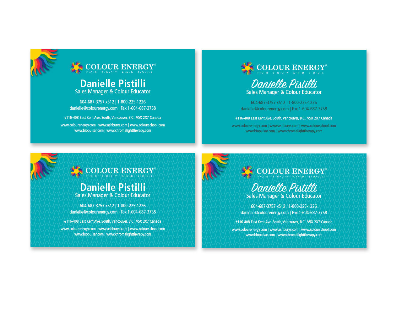
I meticulously designed premium letterheads, envelopes, and business cards that radiated sophistication and professionalism. This bespoke stationery went beyond mere paper and ink; it became a symbol of our company's commitment to excellence. These meticulously crafted materials not only elevated our brand image but also played a pivotal role in attracting prospective clients, nurturing enduring partnerships, and sparking a profound interest in our company's offerings. They served as our ambassador, conveying our dedication to quality and attention to detail before we even exchanged a single word.
3D Mockup Design
Product Mockups
Lifelike Mockups of Products
Product Mockups
Lifelike Mockups of Products
Employing innovative techniques, I harnessed the power of 3D packaging renderings, offering a cost-effective alternative to traditional photo studio setups. By integrating purchased 3D models with meticulously designed packaging artwork in Photoshop, I produced lifelike mockups of our products. These renderings not only served as captivating visuals but were also seamlessly integrated into our website, enhancing product presentation without straining the budget.
Presentation Design
Powerpoint Presentations
Powerful Points, Visual Excellence
Powerpoint Presentations
Powerful Points, Visual Excellence
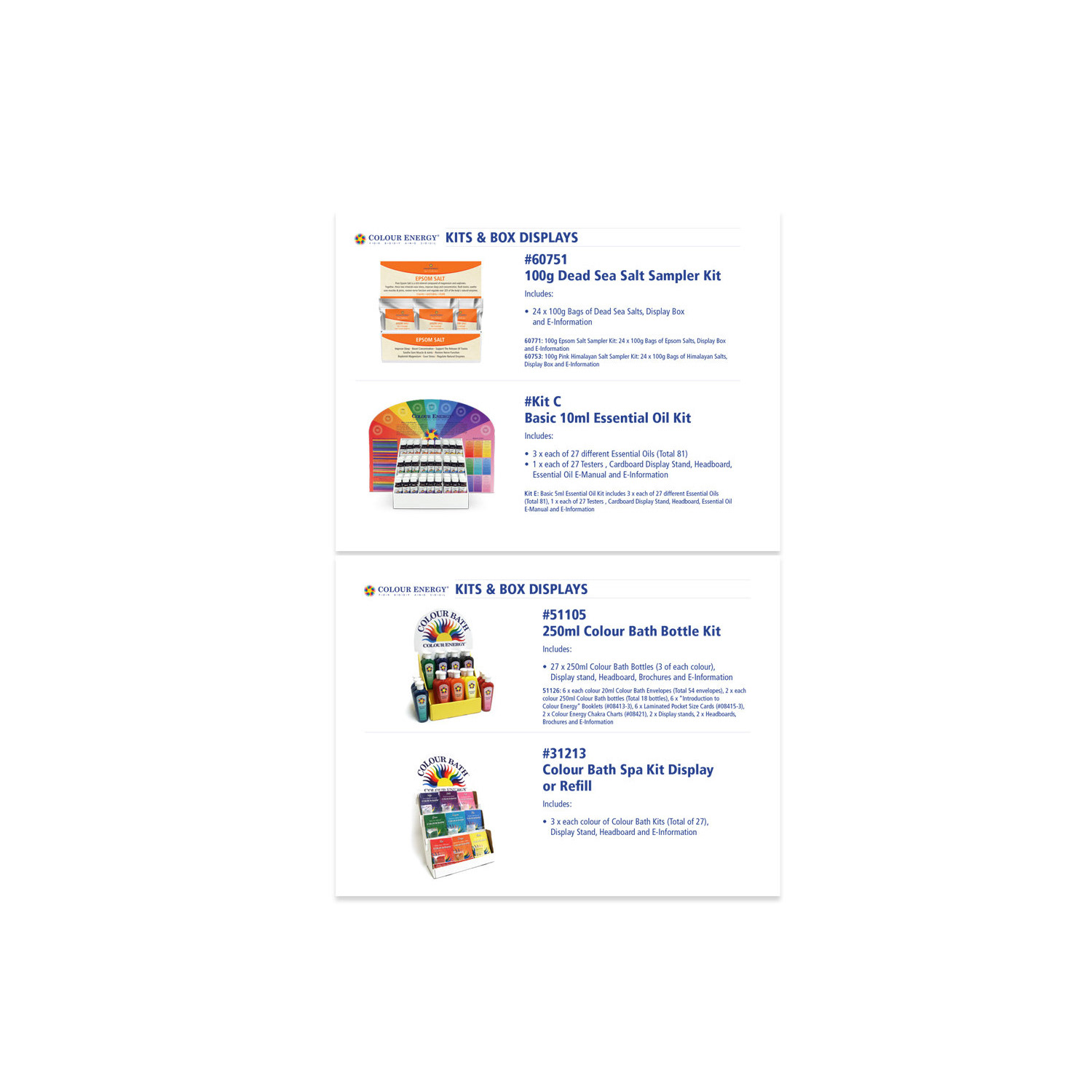
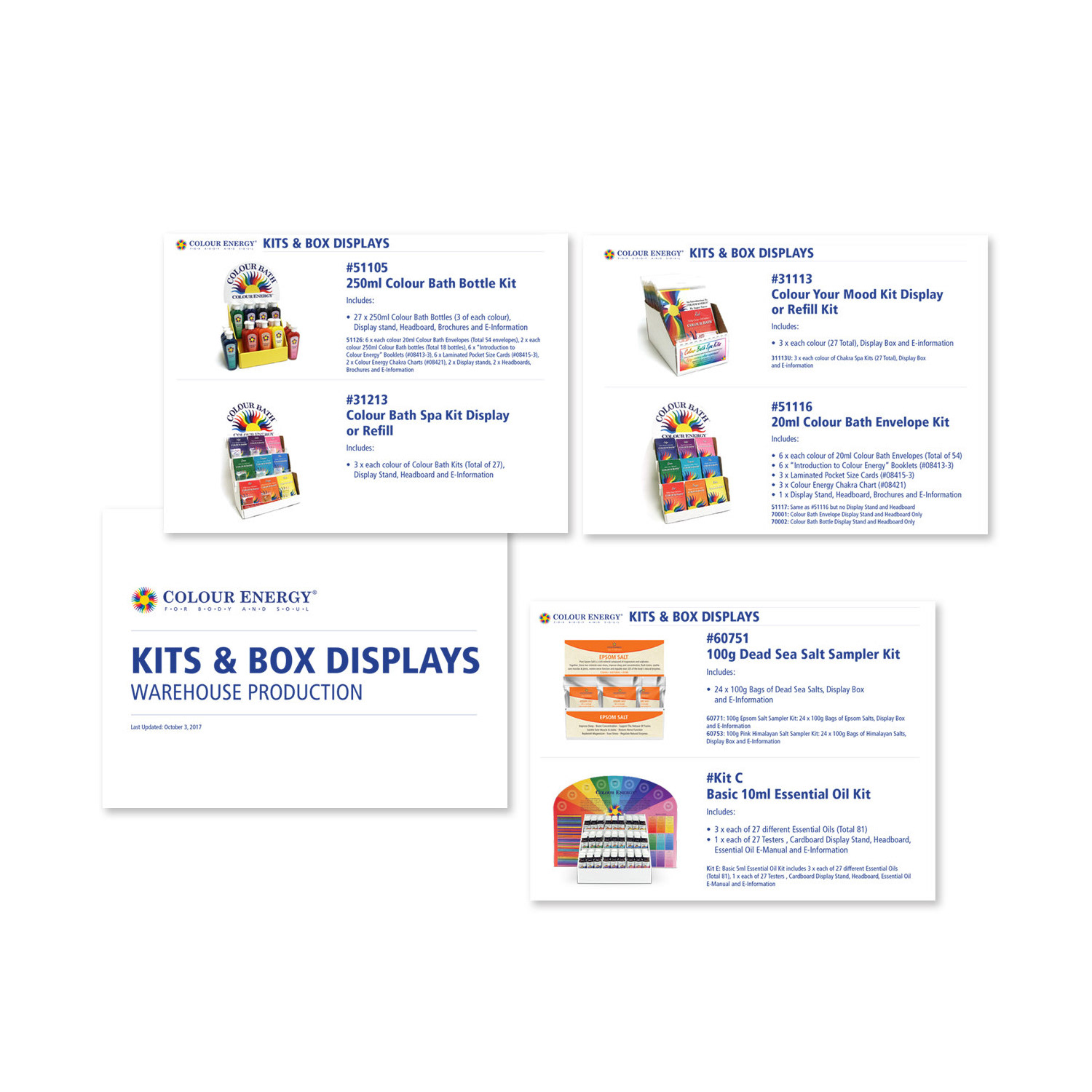
Utilizing my strong design skills, I meticulously crafted visually engaging PowerPoint presentations that played a pivotal role in effectively showcasing the extensive array of product kits and displays. These presentations not only served as informative tools but also captivated the attention of potential clients and employees, facilitating a deep and comprehensive understanding of our product offerings. Through carefully chosen layouts, compelling visuals, and clear explanations, these presentations transformed complex information into accessible and engaging content, fostering stronger connections and interest in our products.
Design Lead
The Chakra Company Corporate Marketing
Elevate The Impact, Touch by Touch
The Chakra Company Corporate Marketing
Elevate The Impact, Touch by Touch
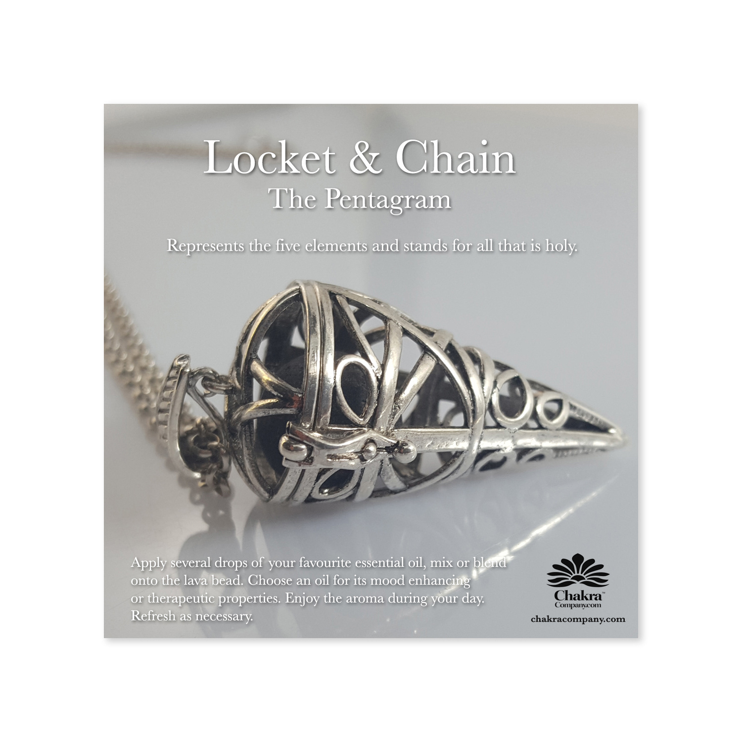
During my tenure with Colour Energy, I spearheaded the establishment and management of The Chakra Company's social media channels, positioning it as the retail arm for Colour Energy's expansive product range, mirroring its wholesale offerings. Leveraging innovative strategies, I conceptualized and developed product mock-ups, providing a cost-effective solution akin to traditional photo studio setups.
These meticulously crafted mock-ups not only enhanced our online presence but also enriched our website's visual appeal. Furthermore, I revitalized the website by integrating HTML elements, seamlessly blending 3D renderings with high-resolution photography. Utilizing advanced techniques like light-box photography, I consistently captured and showcased new product arrivals, ensuring our digital platforms remained vibrant and engaging for our audience.
Social Media Design
The Chakra Company Social Media Channel
Crafting Connections, One Post at a Time
The Chakra Company Social Media Channel
Crafting Connections, One Post at a Time
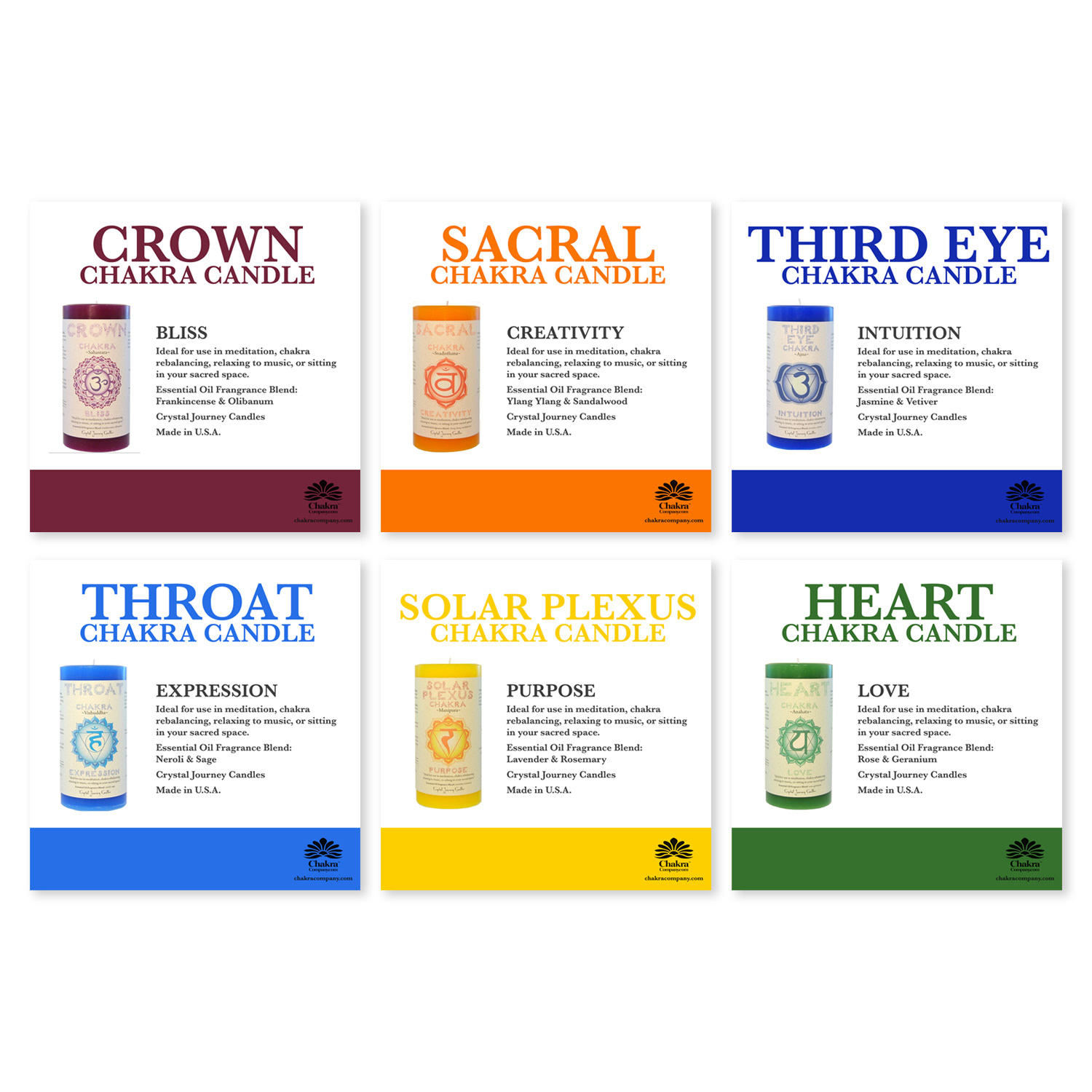
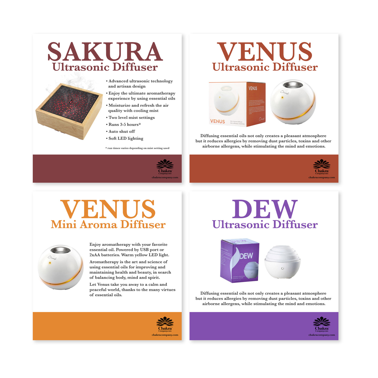
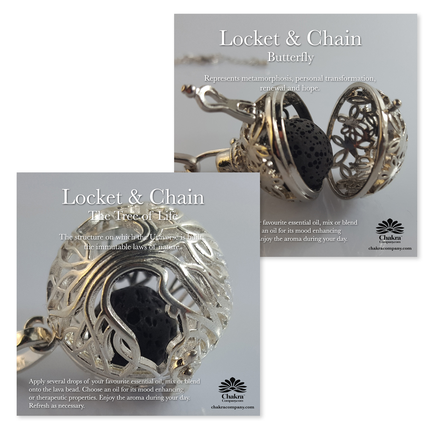
Embracing the core essence of each brand, I meticulously crafted captivating and innovative social media visuals that resonated deeply with our audience. By weaving together compelling narratives and visuals, I elevated engagement metrics, drawing viewers into immersive brand stories as they navigated their feeds. These curated visuals not only highlighted our products but also conveyed the brand's ethos and values, fostering a deeper connection with our followers and amplifying our digital presence.
The Chakra Company Social Media Post
The Chakra Company Social Media Post
Photography
In-House Photography
Capturing the Essence of Products Through Photography
In-House Photography
Capturing the Essence of Products Through Photography
Utilizing a professional light-box setup, I meticulously captured high-quality photographs of products. These images became instrumental assets, seamlessly integrated into our social media posts, as well as both digital and print marketing campaigns, enhancing overall brand presentation and engagement.
The Chakra Company Social Media Post
